
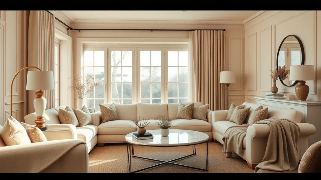
The moment you step into a Nancy Meyers kitchen, you can almost smell the warm bread and feel the quiet confidence of everything placed “just so.” It is not sterile design. It is lived-in comfort with intentional details: soft light, pretty surfaces, and rooms that seem to invite you to stay a little longer.
If you have ever tried to copy the look and ended up with something that feels fussy, dark, or overly themed, you are not alone. The good news is you do not need a million-dollar renovation. You just need the right formulas for color, lighting, proportion, and texture, and a few swaps that make your home feel cinematic without becoming costume.
Below, you will find 23 recreate-at-home ideas, each with practical steps for how to do it in real rooms, real budgets, and real layouts.
Start with the “warm white” paint trick (and stop fighting yellow)
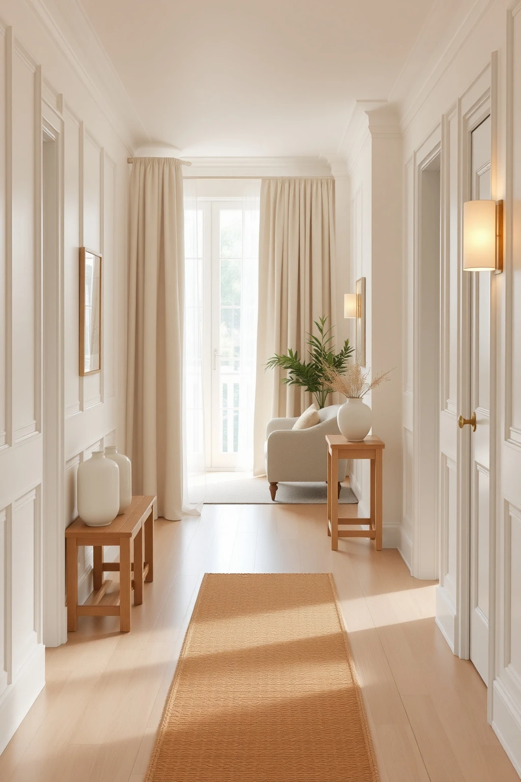
If your room reads either too gray or too neon, the Nancy Meyers look will never land. The secret is choosing warm whites that behave well under morning and evening bulbs, because the aesthetic is all about flattering skin-tone light, not icy brightness.
Pick a warm white with a hint of cream, like Benjamin Moore Chantilly Lace for a crisper feel or Farrow & Ball “Light Blue Gray” is not right here, go for something in the cream family such as “Ivory” or “Setting Plaster.” Test three shades on the same wall, watching them at 8 a.m. and 8 p.m., and choose the one that still looks creamy at night. Use matte or soft eggshell on walls to avoid glare from those gorgeous lamps.
Use three-layer window styling: sheer, drape, and hardware you actually love
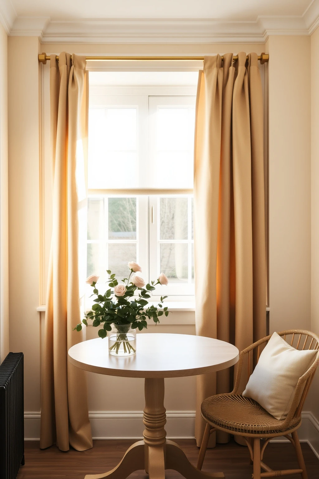
Those big, airy curtains you see in film sets do not happen by accident. They are usually built from layered fabrics and properly spaced hardware, which creates movement and that signature “soft frame” around the window.
For a north-facing room, go with a light sheer panel in warm white, then add heavier drapes in oatmeal linen or a textured cotton. Hang the rod 4 to 6 inches above the window trim and extend it 8 to 12 inches beyond each side so the fabric does not look constrained. If privacy matters, pick drapes with a lined back in ecru or champagne instead of a heavy blackout layer that kills the glow.
Choose rounded silhouettes to make everything feel kinder
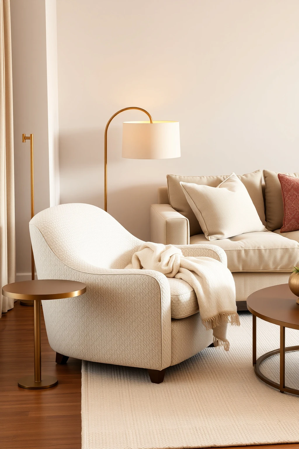
Sharp corners make a room feel like it is trying too hard. Nancy Meyers spaces often favor curves because they soften sight lines and make furniture look more approachable, especially in gathering areas.
Swap out one angular piece for something with rounded arms or a rounded back, like a boucle accent chair or an arched-leg side table in walnut. If you already own a square coffee table, balance it with a large oval rug and a pair of rounded lamps on either side. Keep the upholstery in warm neutrals like cream, oatmeal, or camel so the shape does the work without adding visual noise.
Build a lighting stack: overhead is the last resort
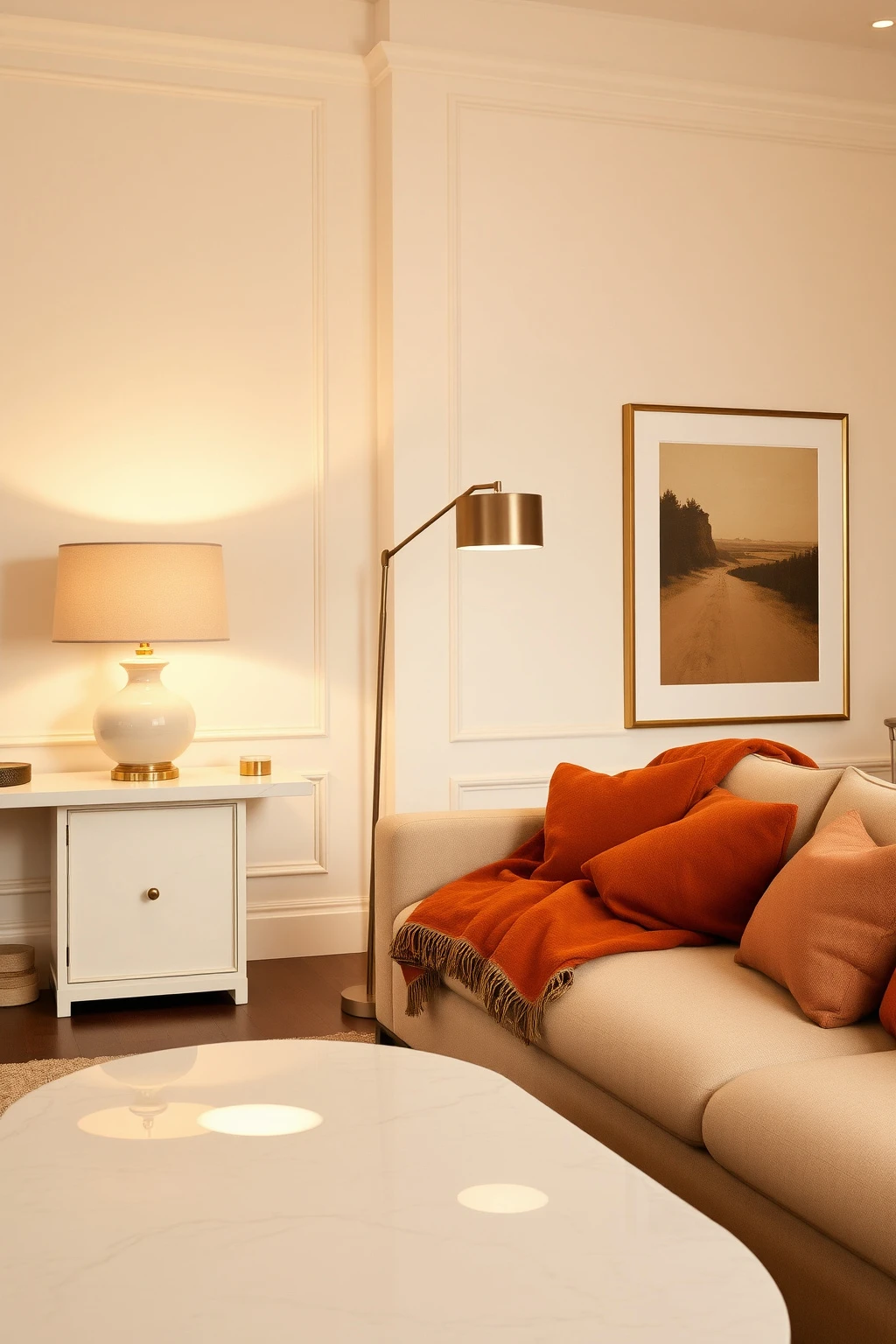
Nothing kills the Nancy Meyers vibe faster than ceiling-only light. That film look depends on stacked illumination so every surface feels softly “lit from within,” not spotlighted.
Aim for three sources in a sitting area: a table lamp near a chair, a floor lamp by the sofa, and one ambient fixture in the background. Use warm bulbs around 2700K, and select shades in linen or parchment to diffuse brightness. A quick rule: if you can see shadows behind a lamp, your shade is too small or too reflective.
Swap harsh hardware for brushed brass or warm bronze
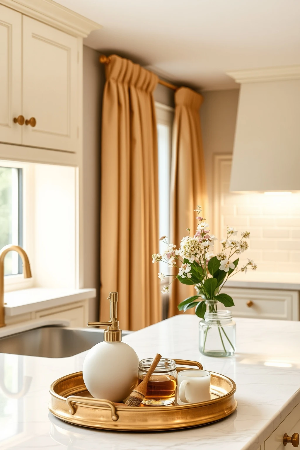
Frosty chrome and overly shiny finishes make a home feel modern in a way that reads cold on camera. Nancy Meyers homes lean toward warm metals that catch light gently, especially in kitchens and bathrooms.
Replace one high-traffic set, like cabinet pulls, with brushed brass or aged bronze in a consistent finish across the space. If you cannot replace hardware, try a styling workaround: add a brass tray to the countertop, a warm metal soap dispenser, and a matching set of canisters. Keep everything in the same family, not mixed metals, because the calm look comes from cohesion.
Use a marble-look moment, even if it is not real marble
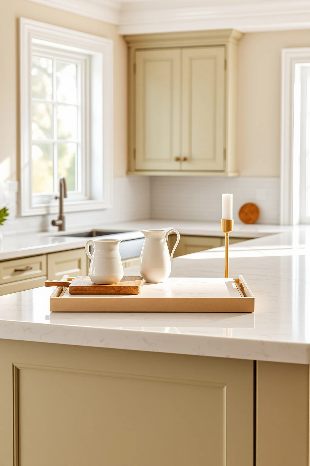
Real stone is expensive, but the design principle is not. Nancy Meyers uses glossy, bright surfaces to bounce light and make rooms feel clean without feeling sterile.
If you want that effect on a budget, choose a quartz or laminate with a subtle veining pattern and a honed or satin finish. Style it like a set: a marble-look tray, a matching tray for candles, and a slim cutting board in light wood so the stone reads intentional. Avoid busy high-contrast veining, which can look costume-y in everyday lighting.
Layer textiles like you are dressing a person: start with a base, then add texture
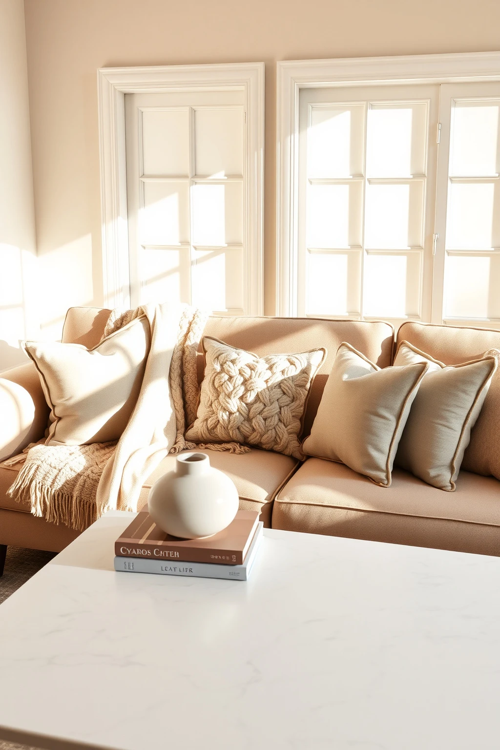
One blanket thrown on a chair never looks like a film set. The Nancy Meyers approach is texture stacking, where each layer changes how the light hits the fabric.
On a sofa, start with a neutral base throw in oatmeal or camel, then add a second layer with a different texture, like a chunky knit or a linen/cotton blend. For color pops, use dusty rose and sage in smaller doses through pillows and a small accent cushion. Common mistake: matching everything too perfectly. Instead, keep colors harmonious but textures noticeably different.
Hang art using the headboard rule (8, 10 inches above)
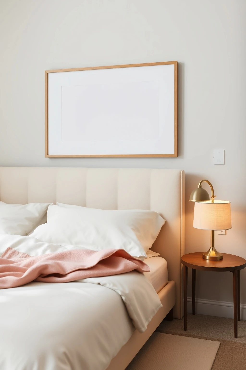
If your art feels oddly low, it is not you. Most people misplace the top edge, which makes a room look unfinished even when everything else is beautiful.
Use this measuring habit: for art above a sofa or console, set the center of the piece at roughly 57 to 60 inches from the floor, then adjust based on your seating. For bedroom styling, apply the “headboard rule,” hanging the bottom of the frame about 8 to 10 inches above the top of the headboard. Stick to frames in warm woods, aged brass, or matte black only if the rest of the room has that same contrast level.
Pick rugs that “connect,” not just match
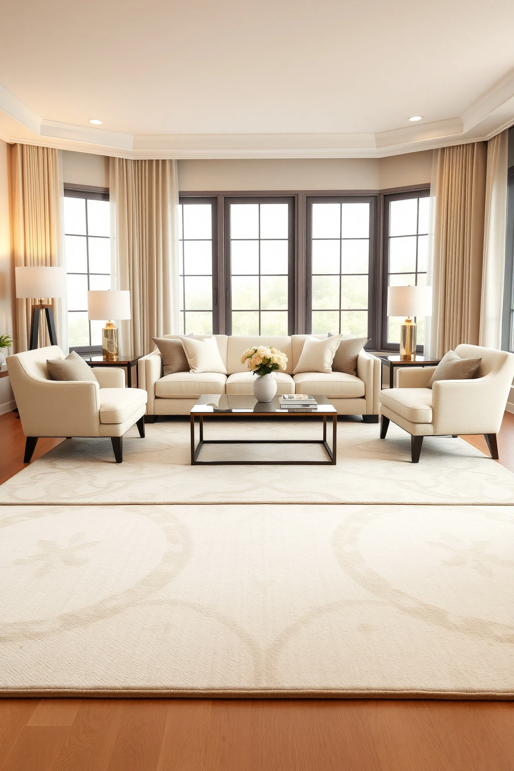
A rug that only matches your sofa color can still feel detached. The Nancy Meyers aesthetic uses rugs to control traffic flow and unify furniture, which is why the rooms feel effortless even when they are carefully planned.
In a living room, choose a large rug so the front legs of your sofa and chairs sit on it. As a starting point, aim for at least 8 by 10 feet for a typical seating area, then adjust to keep 8 to 12 inches of rug visible around the edges. If your room is small, go with a rug that has tonal patterning and enough contrast to define zones, not a busy print that steals focus.
Create a ‘quiet shelf’ with ceramics that look curated, not collected
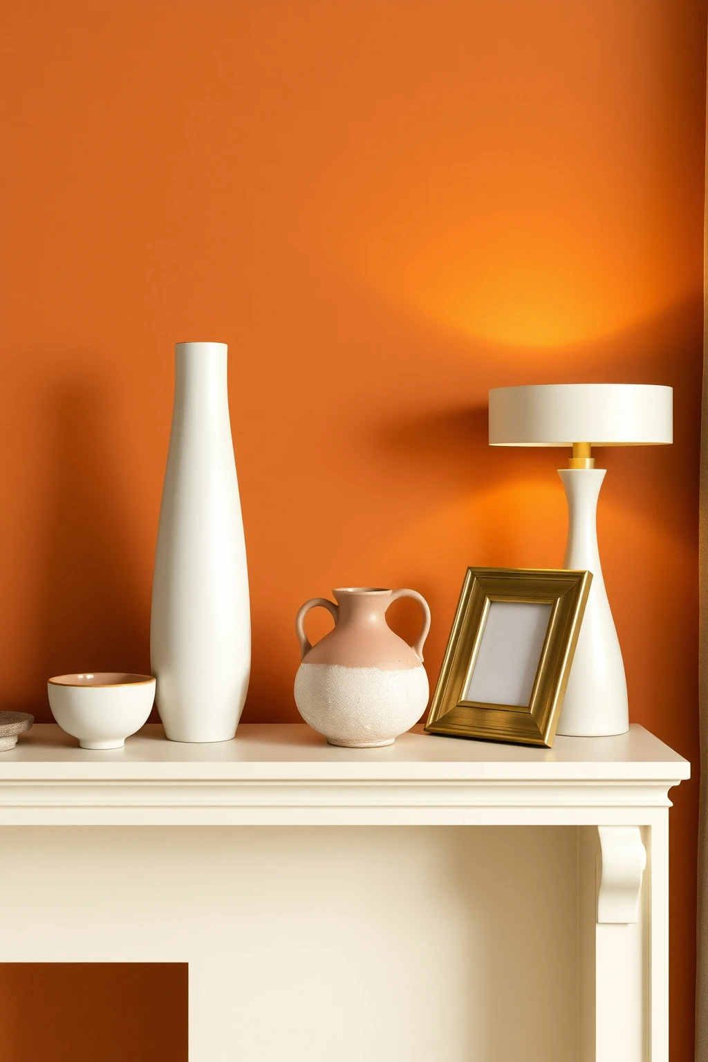
Nancy Meyers shelves feel like they have a point of view, even when they are full of everyday objects. The trick is scale and spacing, not expensive décor.
Use a repeating height ladder: one tall piece (10 to 14 inches), one medium (6 to 9 inches), and one low accent (3 to 5 inches) grouped together. Keep the majority in warm whites and creams, then add one or two signature colors like terracotta or dusty rose. Common mistake: crowding every inch. Leave a few visible gaps so the shelf can breathe.
Make your kitchen counters feel magazine-ready (but not staged)
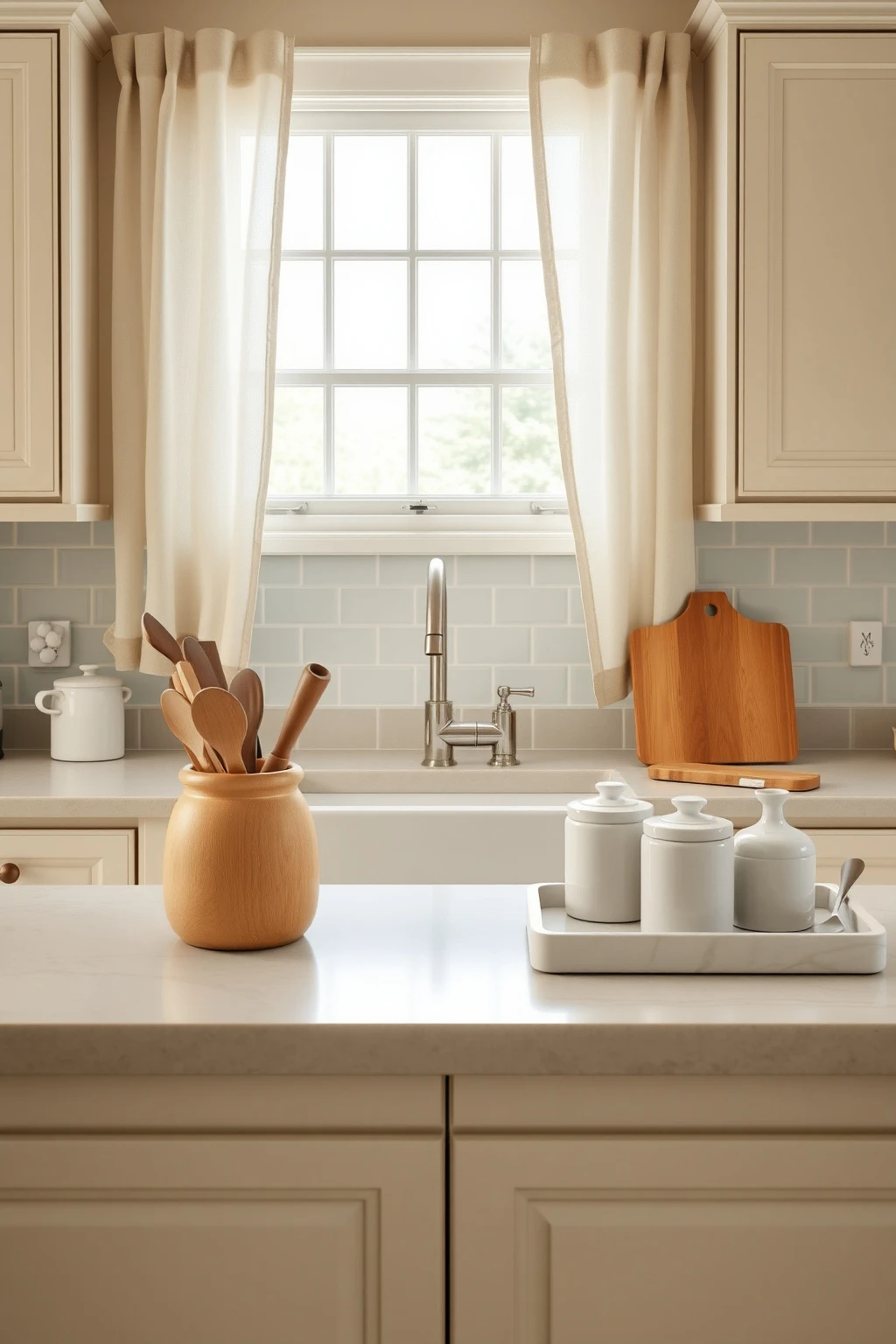
That “emptier than you think” kitchen look comes from choosing a few hero items and hiding the rest. Nancy Meyers kitchens feel functional first, decorative second, so they stay beautiful even when life happens.
Limit countertop décor to three zones: one container for utensils, one for everyday prep (like a wooden knife block), and one pretty tray with regularly used items. Use open jars in matching sets for flour, tea, or pasta so labels do not become visual clutter. Keep one surface visually open, like a 12 to 18 inch stretch of clean countertop near the sink, to make the room feel calm.
Add a breakfast-nook ‘rule of comfort’: seat height matters
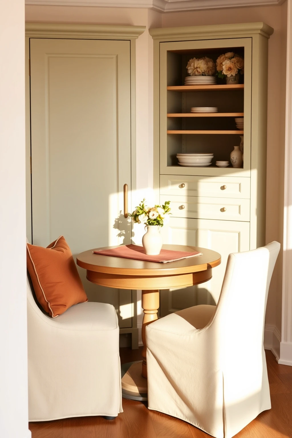
In cozy kitchens, the difference between cute and truly comfortable is often the chair height and the way you sit at the table. If your dining chairs feel slightly too tall or too low, you will subconsciously avoid sitting there.
For a typical counter-height or dining-height setup, aim for a seat that allows your feet to rest flat. If you are buying new, look for chairs with a seat height around 18 inches for standard dining tables, and around 24 to 26 inches for counter-height tables. Add a cushion with a thickness of 1.5 to 2.5 inches so it feels plush without looking sloppy. Finish with washable covers in linen-blend fabric for real-life practicality.
Use ‘soft contrast’ walls: wallpaper on one panel, paint everywhere else
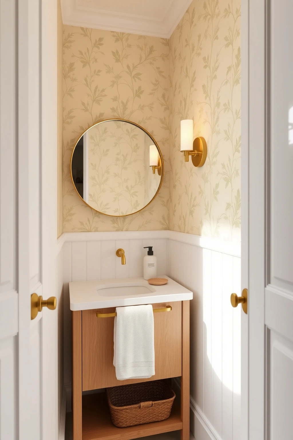
If every wall is busy, the room loses the quiet confidence that makes the Nancy Meyers look work. Soft contrast is about having one focal wall that adds personality while the rest stays calm.
Choose wallpaper with a subtle tone-on-tone pattern, like a small damask or a delicate botanical, and install it on one wall behind the sofa or in a powder room. Keep the other walls in warm white and repeat the wallpaper color through smaller accents, like throw pillows or a ceramic dish. Common mistake: matching wallpaper colors too exactly. Instead, pick one wallpaper color family and let the rest be neutral.
Make entryways feel cinematic with a ‘landing pad’ console
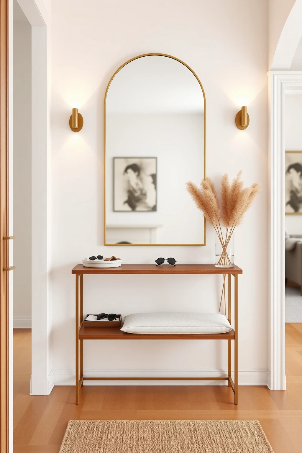
Most entryways fail because there is nowhere for the everyday stuff to go, so everything spills visually. Nancy Meyers entries have a landing pad, which means bags, keys, and mail never become chaos.
Use a console table that is 14 to 18 inches deep, so it does not dominate the space, and pair it with wall hooks at about 72 inches from the floor for easy grabs. Add a large tray for keys and sunglasses and one tall vase or lantern to bring vertical rhythm. If you are in a narrow hallway, choose a slim mirror with a warm frame so the reflection makes the space feel bigger without adding clutter.
Furniture scale: keep aisles at least 30 inches wide
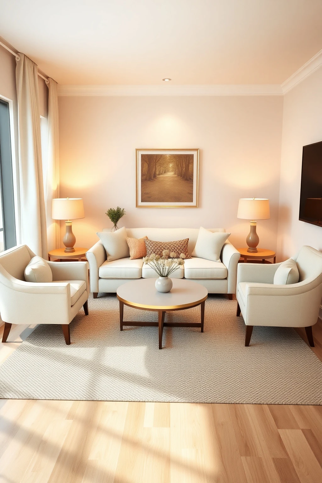
Even the prettiest styling looks wrong when the room is hard to walk through. The Nancy Meyers aesthetic feels effortless because it protects movement between zones.
Before you buy anything, measure your main path from couch to coffee table to entry. Keep a minimum aisle of about 30 inches, and if you can manage 36 inches, even better for comfortable hosting. Pull chairs out from walls about 6 to 12 inches so they do not feel jammed into corners. When space is tight, choose smaller-scale side tables, like 18-inch diameter rounds, instead of big rectangular ones.
Swap big curtains for café-length in small kitchens (and it still feels luxe)
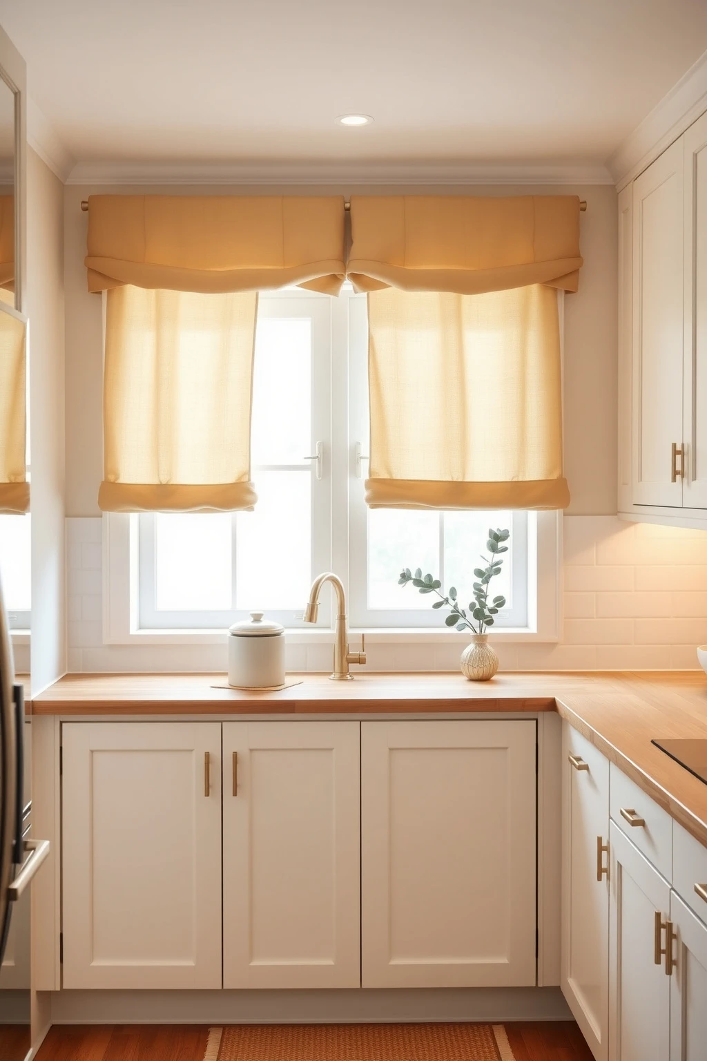
Not every home has the luxury of full-height drapery. In small kitchens, full curtains can overwhelm and visually shrink the room, which is how you lose that airy film-set feeling.
Use café curtains in a warm white or oatmeal linen on the upper portion of the window, leaving the lower light unobstructed. Pair them with a valance-style rod placed close to the top frame for a tailored look. Then bring the Nancy Meyers vibe back through one bigger softness element: a plush runner rug in jute with a cream border or a set of linen seat cushions on a breakfast chair.
Create a ‘reading corner’ with one oversized lamp and a side table that fits
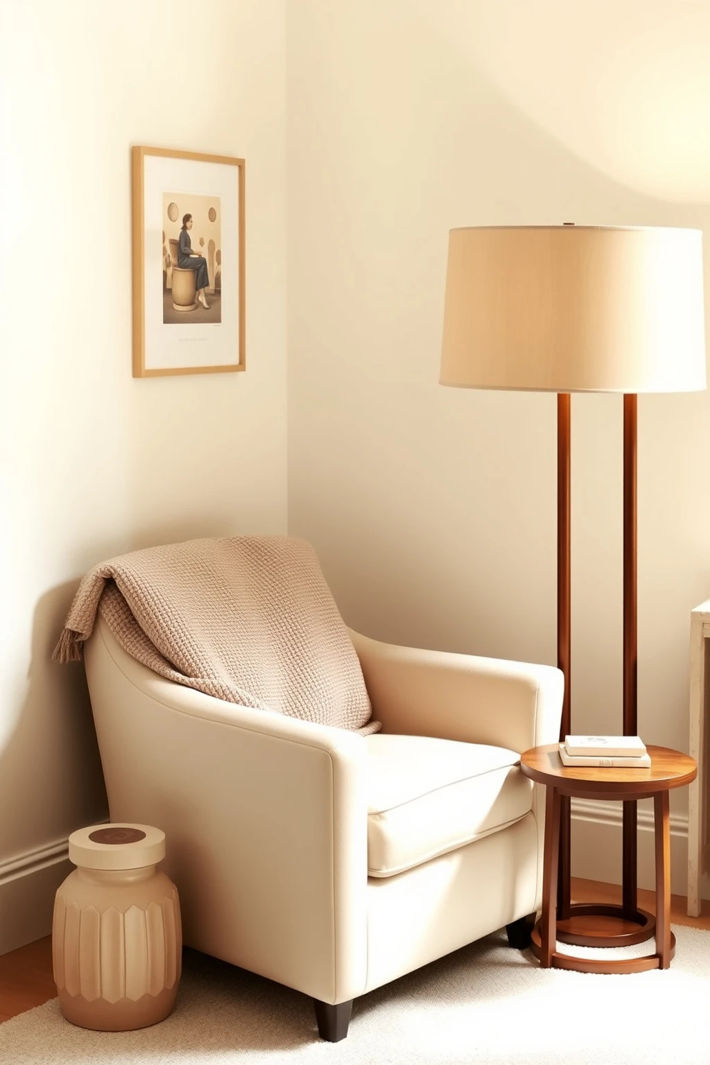
The best Nancy Meyers corners are not crowded, but they are incredibly usable. The secret is a lamp with real reach and a side table at the right height so you can actually relax.
Choose an oversized floor lamp with a wide shade so the light spreads across the seating, not just onto the book. Place a side table within arm’s reach, about 24 to 28 inches from the chair arm, and make sure the top matches the seating arm height for balance. Style with a small stack of books (3 to 5) and one decorative object, like a ceramic bowl or a glass cloche, to avoid clutter. Common mistake: adding three tiny décor pieces instead of one intentional surface.
Bedrooms: dress the bed like a hotel, but keep it soft in the corners
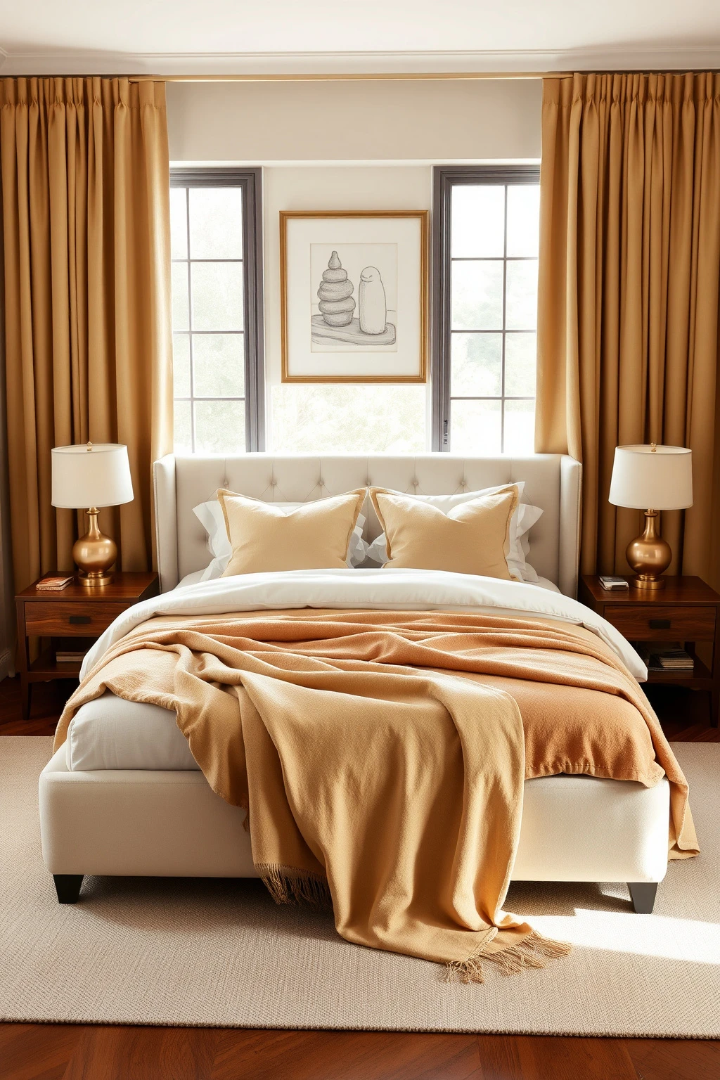
Film bedrooms feel crisp when the light hits them, but they are still cozy. The secret is how the bedding layers fall, especially at the sides and foot where most people under-style.
Use a duvet in warm ivory or pale sand, then add a matelassé or lightly textured cover for that tailored look. Add two to three pillows in the back, then finish with a couple of smaller accent pillows in a coordinated pattern like subtle stripes. Tuck a throw at the foot of the bed and let it drape 6 to 10 inches beyond the mattress so it looks intentionally casual. Skip overly shiny satin sheets, which can read too costume-like under warm lamps.
Bathrooms: hang towels low and choose “pretty useful” storage
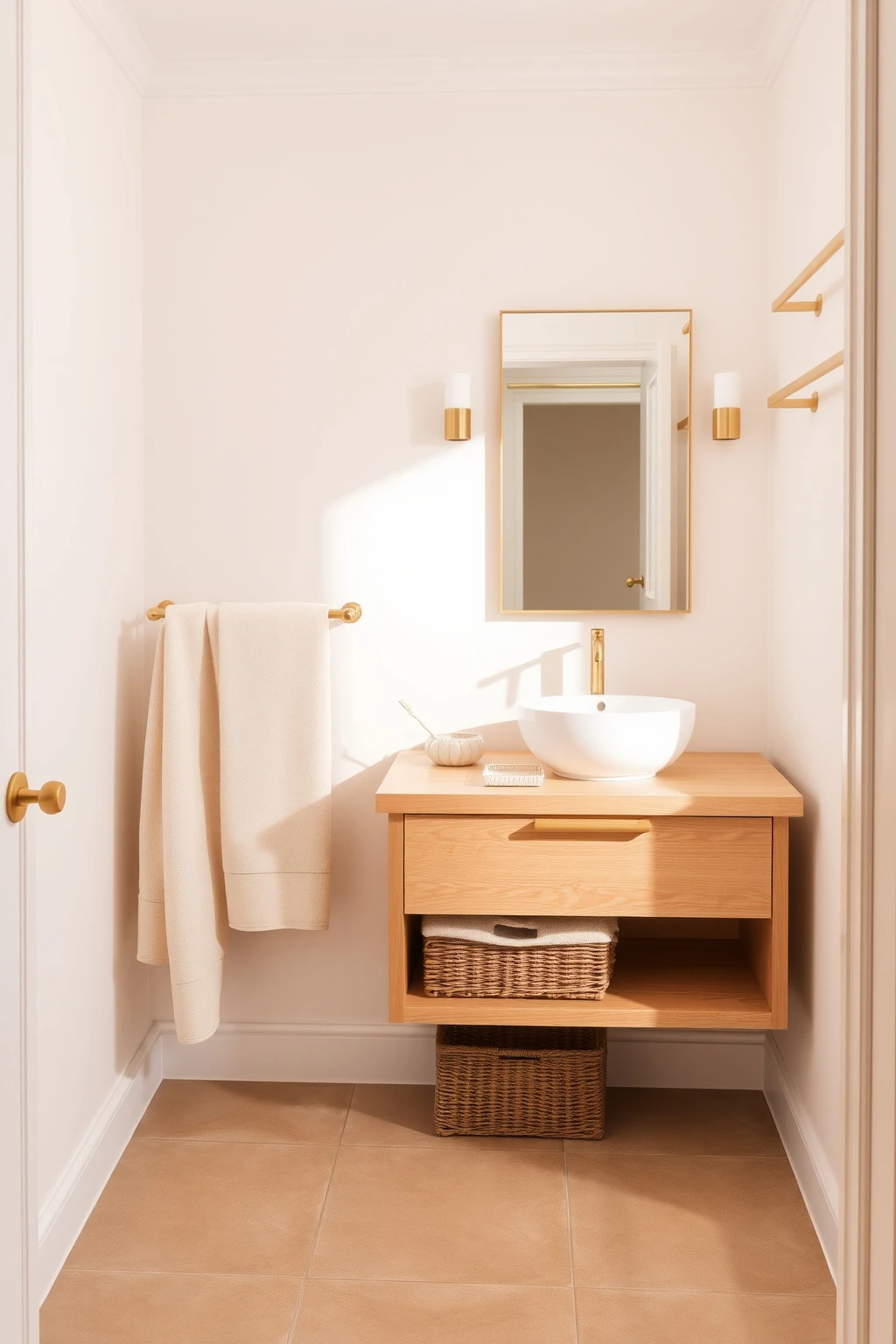
If your towels look like they are performing, the room loses its ease. Nancy Meyers bathrooms feel calm because the linens are always where your hand naturally goes.
Hang hand towels on a towel bar 36 to 42 inches from the floor for easy grabbing, and use a second bar for bath towels that sits slightly higher for visual structure. For storage, choose a wicker basket lined with a linen towel set, plus a small tray for skincare so bottles do not create visual clutter. Use warm white or soft greige hand soap and a brushed brass mirror frame to keep the palette consistent with the rest of the home.
Dining spaces: size your rug for conversation, not the table alone
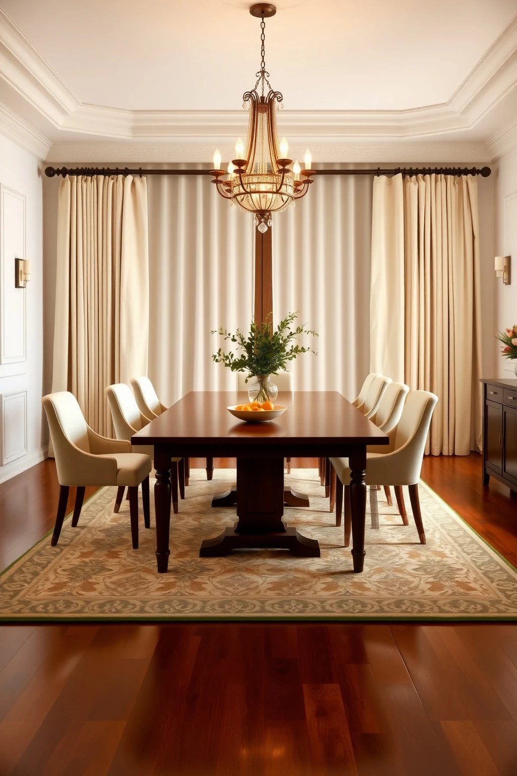
A common dining-room mistake is buying a rug that fits the table but not the chairs. When chairs pull back, the whole room looks suddenly unfinished, and it breaks that polished, hosted feeling.
Choose a rug large enough that when chairs slide back, you still have rug underfoot. A good starting point is to add 24 to 30 inches to each side of your table width and length. Keep the palette classic: warm beige, oatmeal, and subtle charcoal patterning. Then add a centerpiece that is edible or realistic, like a low bowl of oranges or a vase with 12-inch stems, so it reads fresh instead of decorative-only.
Use ‘single-statement’ wallpaper or tile backsplashes, not both
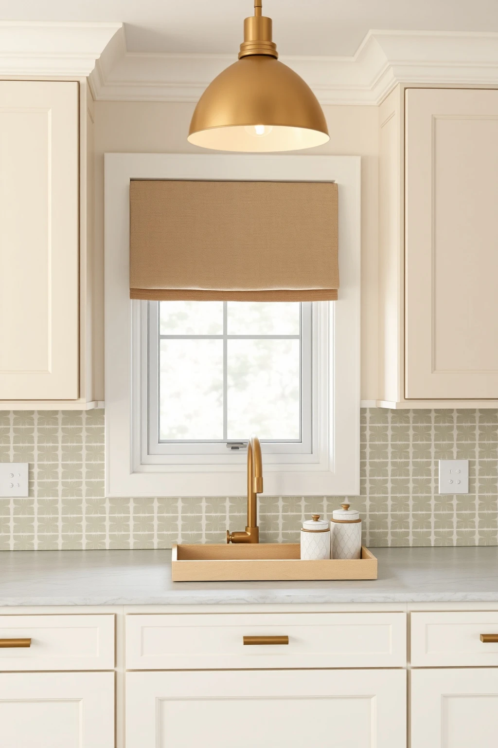
Too many “star” elements make rooms feel loud instead of sophisticated. Nancy Meyers spaces often let one bold surface carry personality while the rest stays neutral.
If you install patterned backsplash tile, keep walls around it in a simple warm white and skip additional wallpaper nearby. If you go with statement wallpaper, choose a plain backsplash in subway tile or small-format ceramic in warm white. Tie the scheme together with one repeat color, like sage in wallpaper, brought back through dish towels or a vase. This keeps your eye from darting and makes the room feel curated, not busy.
Recreate the “tea table” moment with trays and height variation
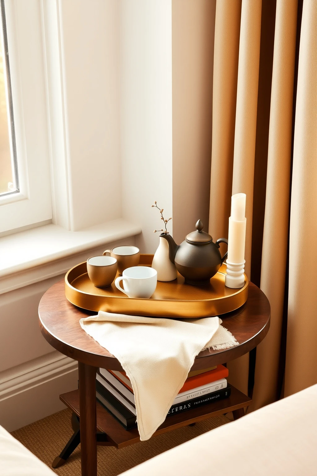
That tiny, polished table by the window is not about having more stuff. It is about arranging fewer items with intentional height, so the whole vignette reads warm and composed.
Pick a tray in brass, wood, or lacquered cream and keep it to about 12 to 18 inches wide for a side table. Stack a small book or box under a candle so the height feels layered, then add one meaningful object, like a ceramic mug set or a petite vase with one stem. Use a color rule: one neutral base, one warm accent like terracotta, and one “sparkle” metal finish. Avoid random collections with different colors that fight under lamp light.
Quick refresh for renters: paneling-look wall molding without the commitment
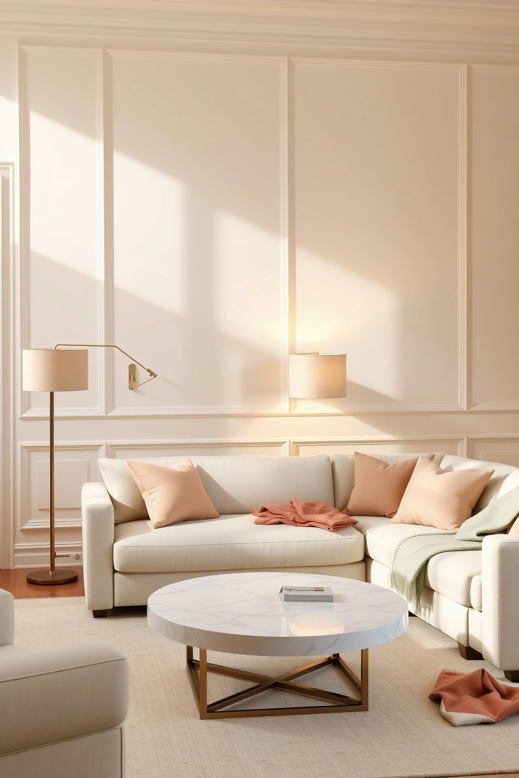
You can get the classic Nancy Meyers backdrop without tearing down walls. Raised wall molding adds structure and makes paint colors look richer, especially in warm whites and soft creams.
For renters, use peel-and-stick or lightweight moldings designed for paintable surfaces, placing vertical strips on one feature wall or around a doorway. Keep spacing consistent, about 6 to 8 inches between trims for a refined, modern-classic look. Paint the wall and molding the same warm white, or slightly vary by one shade so the relief catches light. Common mistake: going too thick or too far spaced, which can look DIY rather than architectural.
Conclusion
You do not have to live in a movie set to get that Nancy Meyers feeling. Focus on warm, flattering light, a cohesive palette, and one or two intentional “hero” surfaces, and the rest of the room will start to behave.
If you try just one thing this week, make it a lighting overhaul: add a lamp with a soft linen shade and aim for layered brightness. That small change makes your colors look richer, your textures feel inviting, and your home suddenly feels like it was styled by someone who actually lives there.

Mush Decor
Writes about accessible, timeless interior styling for readers worldwide.
More about Mush DecorRelated articles
 Bedroom
21 Cozy Shared Kids Bedroom Ideas
Get cozy, practical shared bedroom ideas: storage zones, smart layouts, calming colors, and styling tips for two kids.
Read More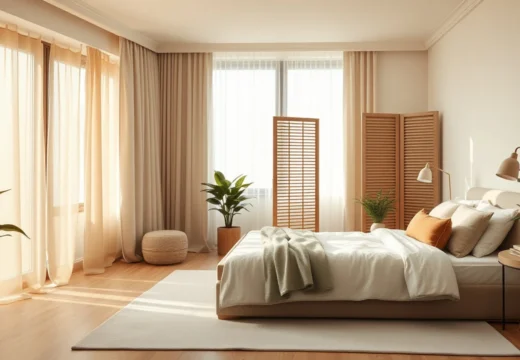 Bedroom
24 Bedroom Screen Ideas for Privacy & Style
Discover 24 stylish bedroom screen ideas for privacy, zoning, and flexible decor, from linen room dividers to DIY slat walls.
Read More