
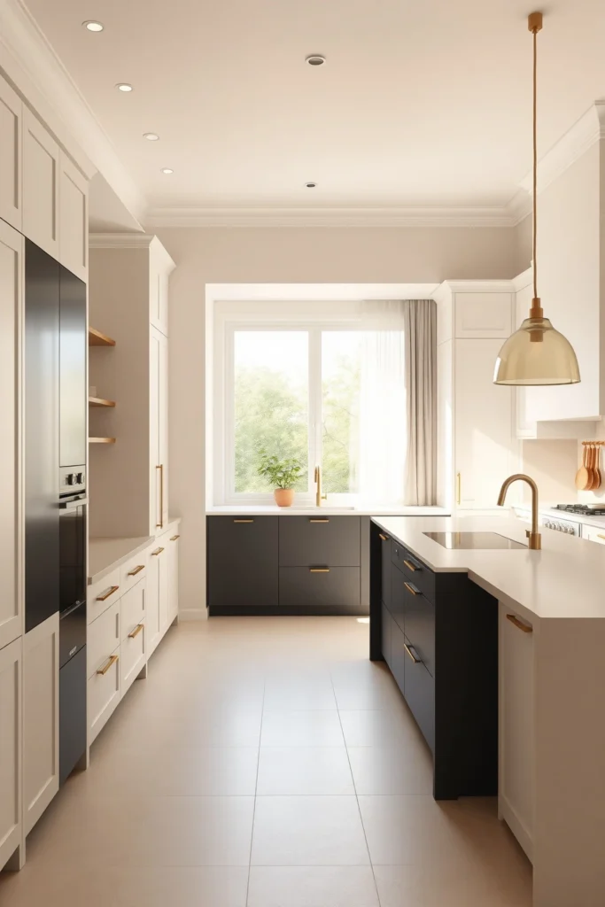
The fastest way to make a kitchen feel “modern” isn’t a new appliance—it’s the way the space moves. If your fridge, sink, and cooking zone don’t feel like a smooth loop, you’ll notice it every single meal.
You’ll also notice modern kitchens have a quiet confidence: clean lines, intentional contrast, and surfaces that look good up close without being precious. In the ideas below, you’ll find design choices you can actually execute—like exact cabinet hardware placement, smart lighting temperatures, and countertop pairings that won’t fight your floors.
Scroll through 23 modern concepts, each with a practical how-to. Think of it as a checklist you can style with your own budget, from renter-friendly updates to full renovation moves.
Build a kitchen work triangle that actually feels effortless
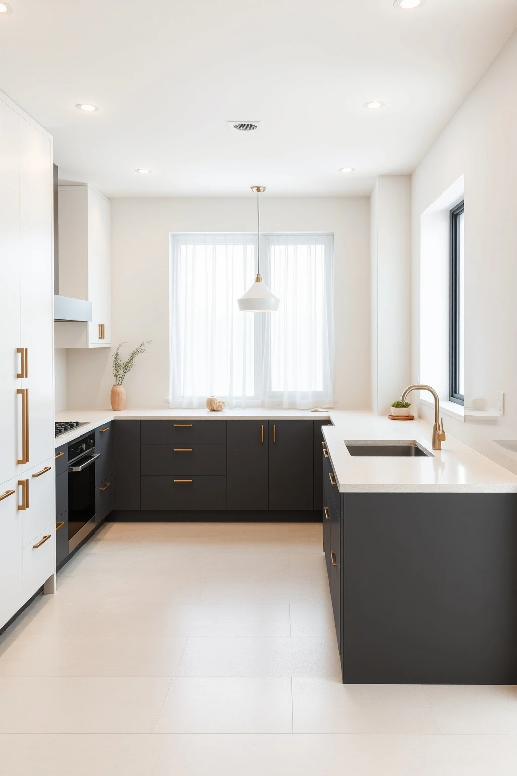
If cooking feels like you’re constantly zigzagging, your “modern” look will never land—even with gorgeous cabinets. A better work pattern makes the room feel calm, because your body follows a predictable route. Aim for a sink-to-cooktop-to-fridge loop that supports quick movement, not a perfect blueprint fantasy.
Start by measuring the distance between the centerlines of your three zones. Try to keep sink-to-stove around 36–48 inches and stove-to-fridge around 48–72 inches; if you can’t, use a counter landing zone so you’re not carrying hot pans across open space. In a tight kitchen, place the “landing” counter 16–24 inches wide between the sink and the cooktop so you can set down items without blocking traffic. Then keep the main aisle at least 36 inches wide for two-way flow—anything narrower makes modern minimalism feel cramped.
Choose one “hero” material and let the rest whisper
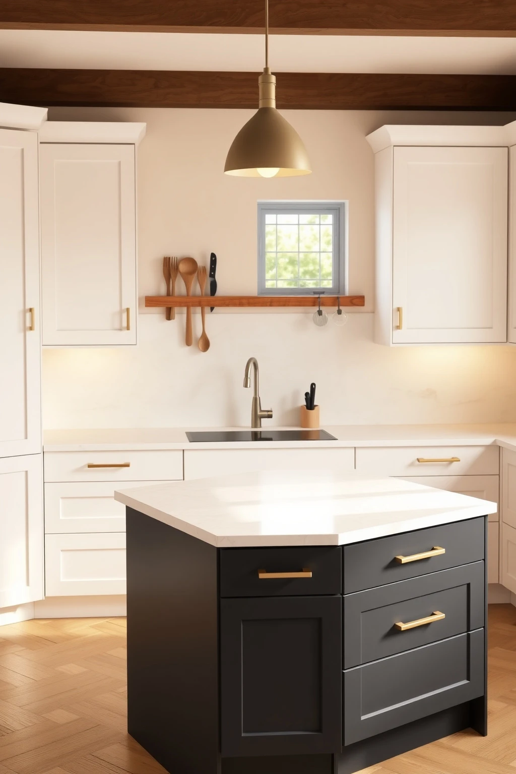
Modern kitchens look expensive because they don’t compete. If you use three bold materials in the same visual lane—say, glossy stone, busy tile, and loud wood—the room loses cohesion fast. Pick one hero material for the counter or island, then keep the surrounding finishes quieter.
For a copy-ready combo, choose a warm ivory quartz countertop and make the island a matte charcoal base in a flat laminate or satin-painted finish. Keep the backsplash simple: smooth porcelain in a pale cream with minimal variation, not a high-contrast marble slab. Use oak or walnut only in small, controlled doses—like a slim wood utensil rail and a cutting board display—so the wood doesn’t fight the stone. Finish with matching slim brass hardware to unify everything; hardware color is the tiny detail that makes a whole kitchen look intentional.
Swap shaker edges for sleek millwork profiles
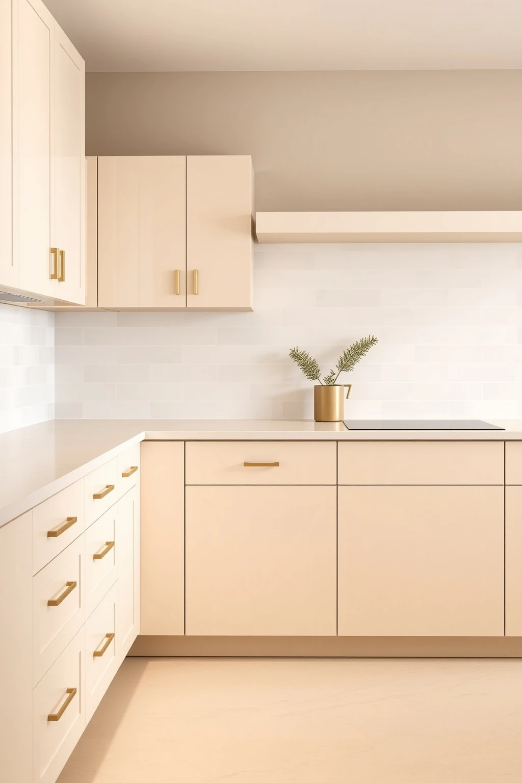
A shaker-style kitchen can look modern, but the wrong shaker details make it read dated. If your doors have chunky rails or heavy recessed panels, you’ll feel “traditional” even if your appliances are new. The modern move is a cleaner door edge and a slimmer profile around the face.
If you’re remodeling, ask for slab or flat-panel doors with a gentle bevel—not a deep inset. For a budget update without demolition, change hardware first: choose long bar pulls (about 5–6 inches center-to-center) instead of small knobs, because length visually stretches the cabinetry line. Then paint existing boxes a warm white with a durable cabinet paint sheen (eggshell on walls, satin on trim) so light bounces without looking shiny. Keep the backsplash minimal so the door edges remain the star.
Use under-cabinet lighting like an editor, not a nightlight
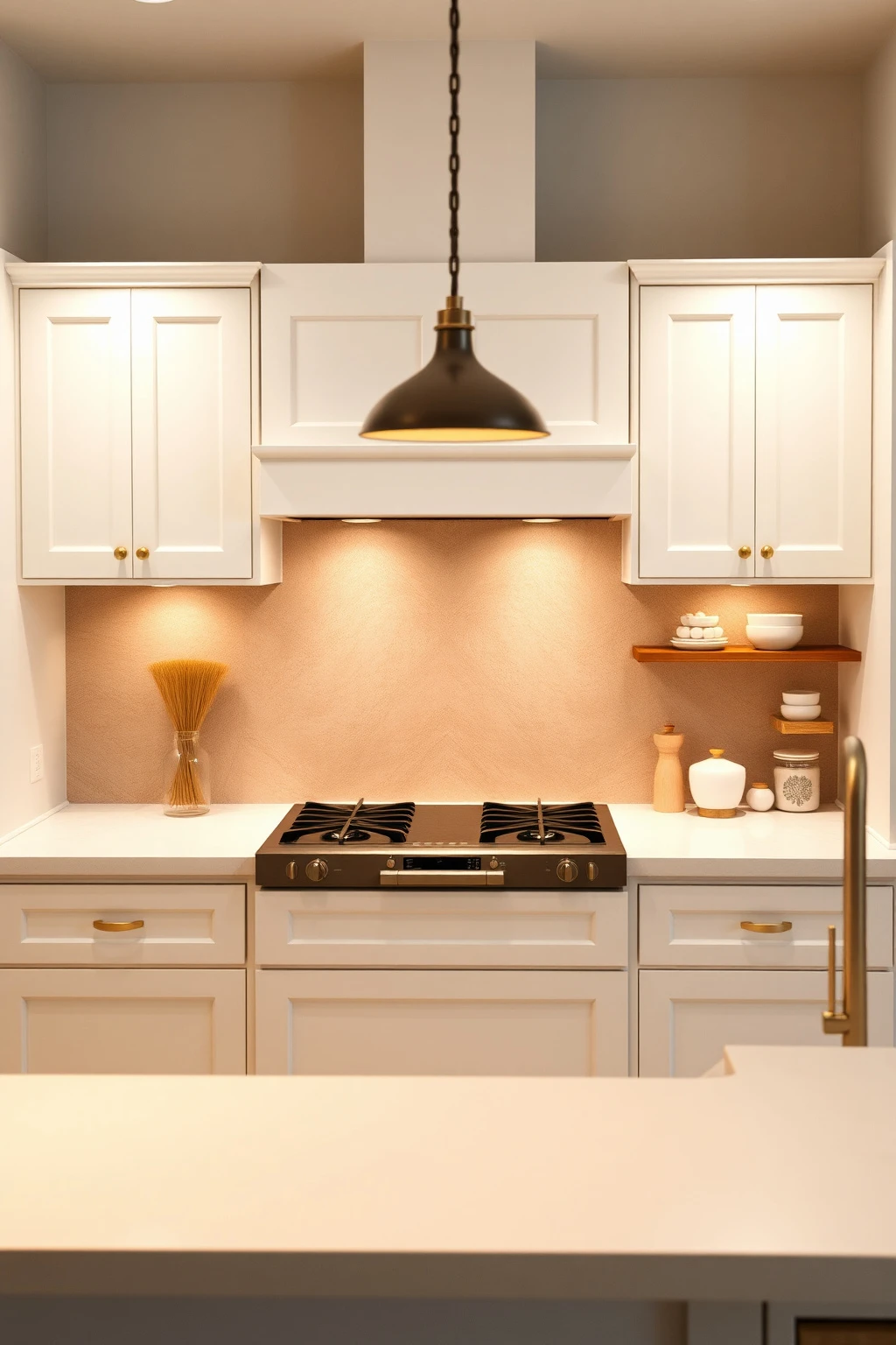
Overhead-only lighting makes countertops look dull and food prep zones feel shadowy. Modern kitchens need a “print-ready” evenness so every surface looks good up close. Under-cabinet lighting is the fix, but placement matters more than brightness.
Install linear LED strips with a diffused lens so you avoid harsh pixel dots along the strip edge. Keep the light 1–2 inches from the underside lip and aim it so it washes the counter, not the cabinet face. If you’re choosing color temperature, go for 2700K–3000K for a warm, flattering kitchen; 3500K can feel too icy for evening cooking. Add a dimmer for instant mood control—set to lower levels when entertaining so the room feels polished without looking like a showroom.
Go vertical with tall pantry storage (even in a small kitchen)
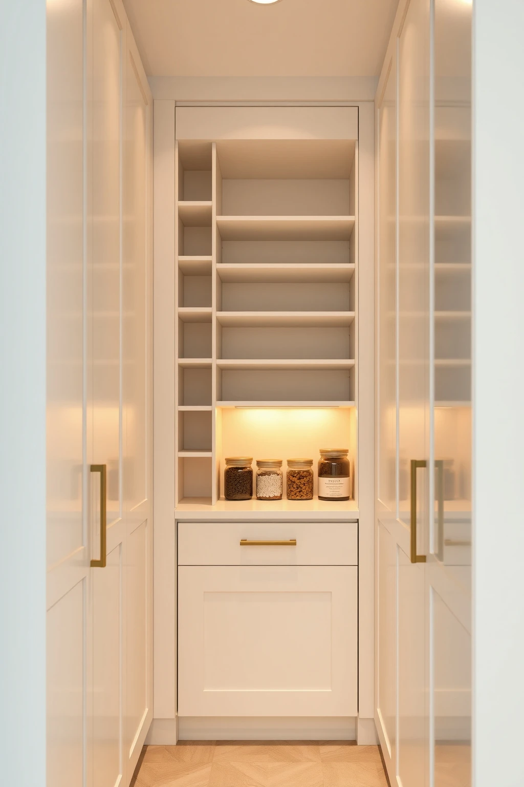
If your kitchen feels messy, it’s often because storage is spread out too wide. Modern kitchens look streamlined because everything has a “home” within arm’s reach. Tall pantry units solve that by stacking categories and reducing clutter visually.
Choose a pantry width that matches your cabinet depth—common is about 24 inches—and plan for adjustable shelves so you can reconfigure as needs change. Add a pull-out spice drawer at the top (about 12–15 inches high) so spices don’t become countertop clutter. For the rest, group items: baking goods in one zone, everyday oils and vinegars in another, and snacks behind a door to keep the surface calm. Use matching roll-out trays and label them lightly with removable labels if you’re the type who reorganizes every few months.
Create contrast with matte + gloss in the right places
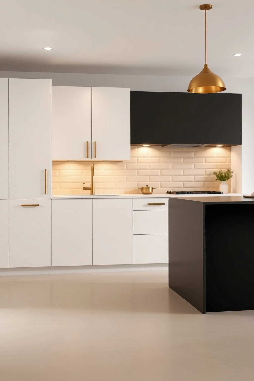
All-matte kitchens can look trendy but also a little flat, especially in north-facing light. The modern trick is contrast—matte surfaces for calm and gloss accents for depth. If you balance them correctly, the room looks tailored rather than busy.
Pick one matte base: matte charcoal island, satin-painted walls, or matte laminate cabinets. Then add one gloss touch: a glossy ceramic backsplash in a warm white, or a few high-gloss cabinet fronts on a single wall run. Keep the gloss limited to about one “panel width” per sightline so it feels intentional. Finish with a metal that bridges both—brushed brass or champagne bronze reads softer than chrome and looks great with matte paint.
Style open shelving without turning it into a storage dump
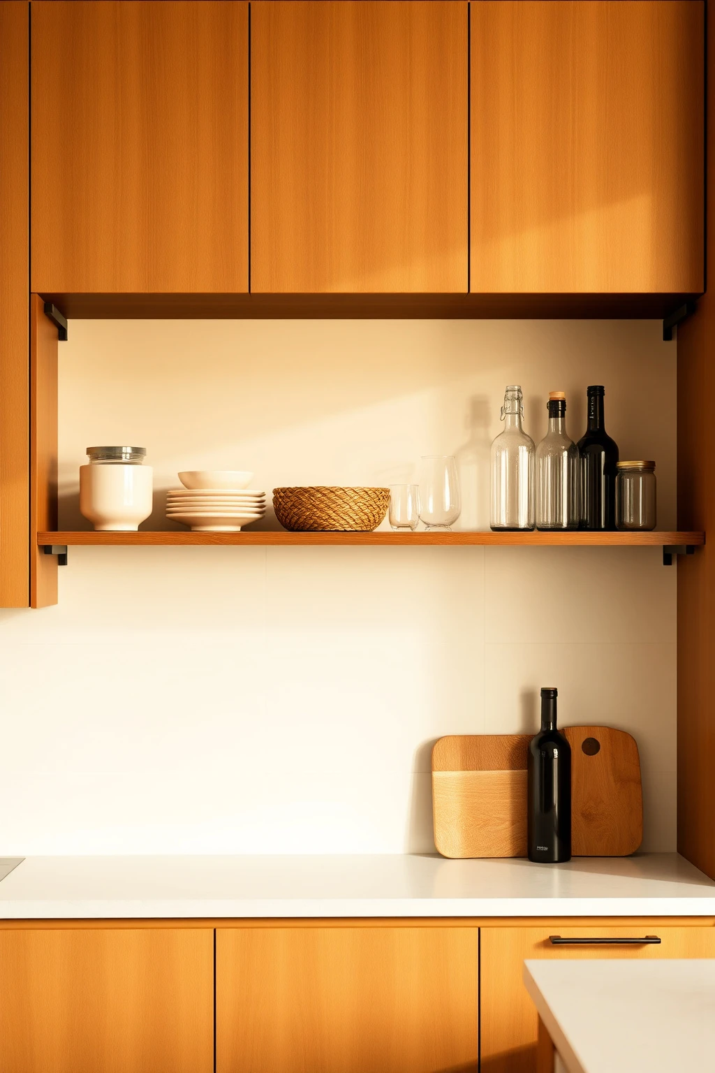
Open shelves can look modern and airy, but only if you’re curating—not tossing dishes up there. The mistake is using mismatched heights and colors, which makes the whole kitchen feel chaotic. Think of your shelves like a magazine spread: repeated shapes, consistent tone, and negative space.
Use shelves for just 3–4 categories: everyday plates, glassware, a stack of cookbooks, and one “texture” object like a linen-lined basket. Keep containers uniform in color—try warm ivory ceramic, clear glass, and natural woven baskets. Arrange items in vertical stacks: place tall bottles or canisters in back and keep front pieces flat so you don’t block sightlines. For most kitchens, limit shelf display to about 60% of the available space so the empty areas calm the eye.
Upgrade your backsplash: use full-height to change the whole scale
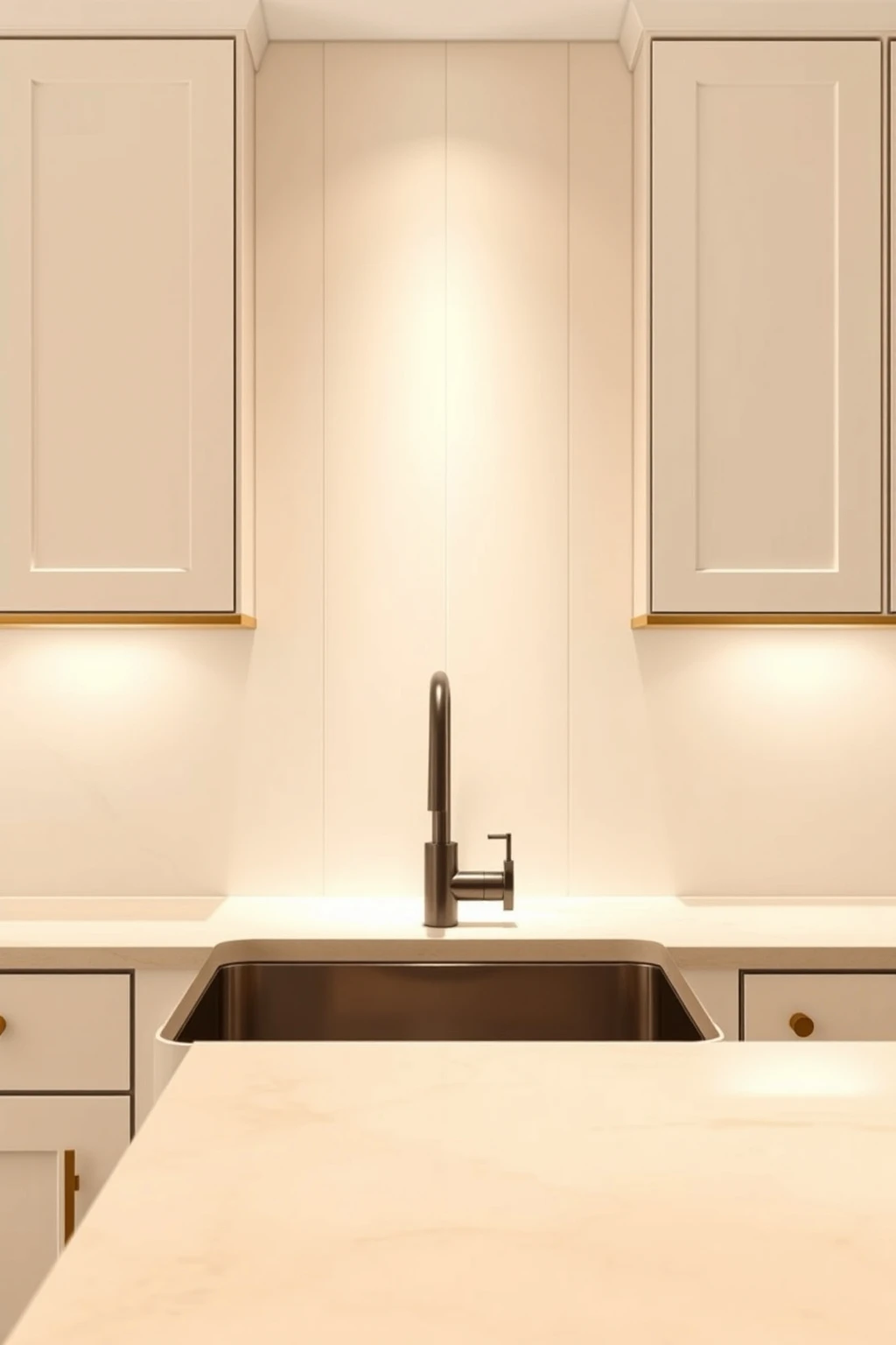
A short backsplash can make modern kitchens feel chopped up, especially if your cabinetry is tall. Going full-height adds visual continuity and frames the room like a backdrop. It also protects your wall where real cooking happens—splashes don’t care about style.
If you can, run the backsplash from countertop to the underside of upper cabinets (or all the way to the ceiling if you have open shelving). Choose a material with low visual noise: large-format porcelain in a soft cream, or a smooth stone-look slab. Keep grout minimal—light grout in a warm tone works better than stark white when paired with warm metals. Then seal and maintain it; modern kitchens look “just done” longer when the backsplash wipe-down is easy and stain-resistant.
Make your island do double duty with a waterfall edge
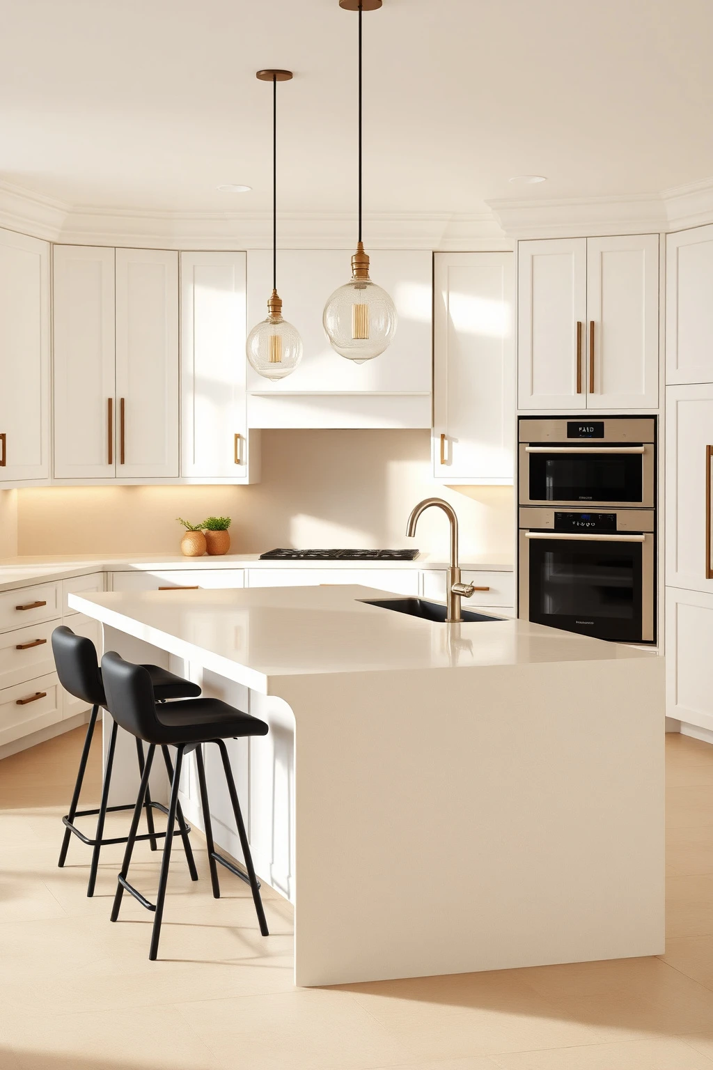
A basic island is functional, but a well-designed island becomes the kitchen’s focal point. Waterfall edges look modern because they create a continuous surface and a strong visual boundary. The key is choosing edge thickness and finishes that don’t feel heavy.
Go for a clean waterfall on the island front and keep the countertop on the perimeter simple—same stone, but you’ll want the island to read as the “sculpture.” Use a quartz or solid-slab material in warm ivory or light greige to avoid visual clutter from busy veining. Keep the waterfall edge thickness around 1.5–2 inches so it feels sleek instead of chunky. For comfort, leave at least 42 inches of clearance from the island to the opposing run so chairs don’t scrape and you can pass without doing gymnastics.
Choose hardware proportions that match your cabinet scale
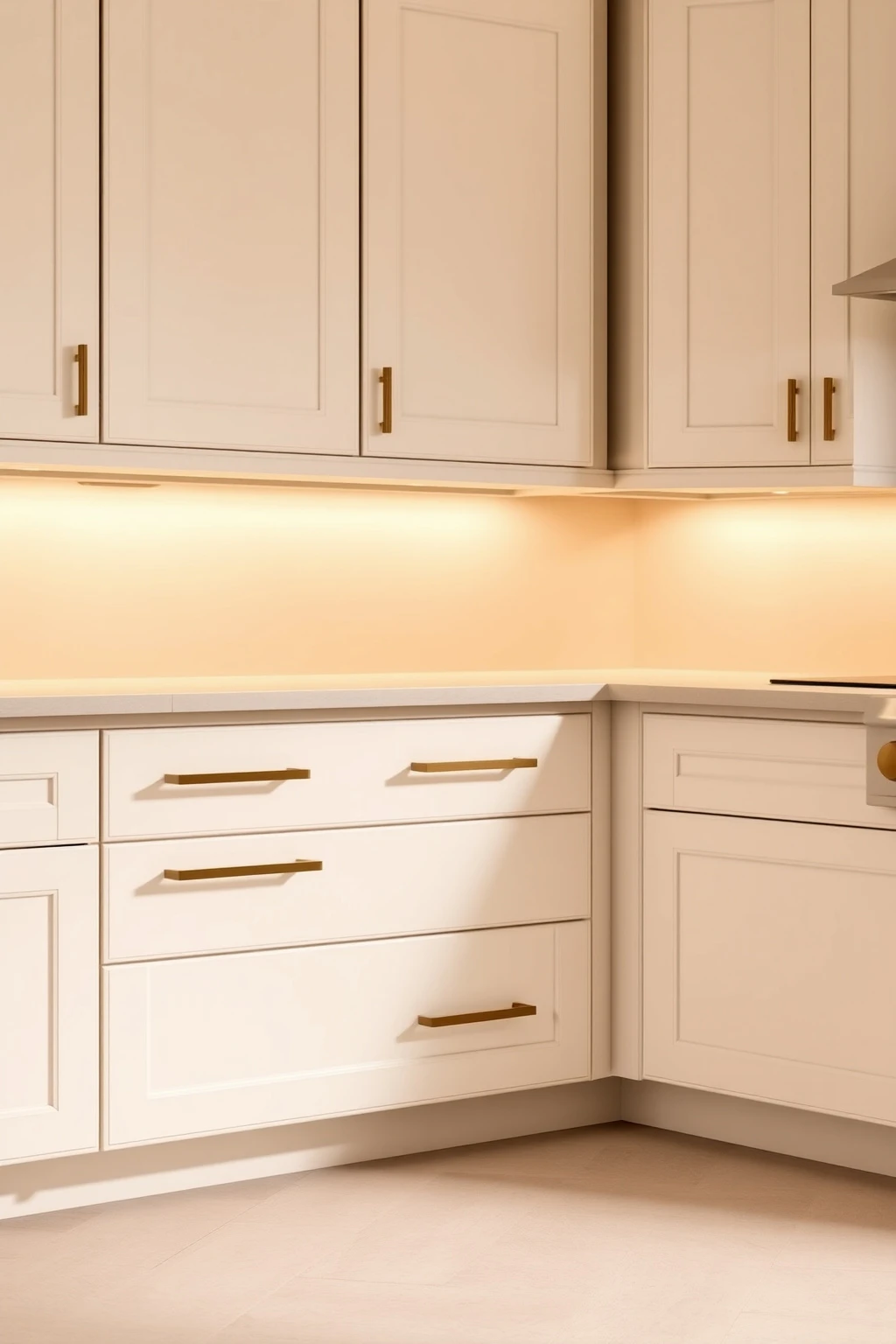
Small knobs on large doors can make a kitchen look like it’s wearing the wrong clothes. Modern kitchens feel right when hardware scale matches the face of the cabinetry. This is one of those details that’s invisible until it’s wrong.
For flat-panel doors 30–48 inches wide, consider long bar pulls or minimal cup pulls sized so the pull length is about half the door width. Typical modern proportions: 5–6 inches for drawer pulls on lower cabinets and 8–12 inches for door pulls on large uppers. Place hardware so it sits centered vertically—on drawers, keep it aligned at the same height across the run for rhythm. If you’re retrofitting, fill old holes with cabinet-grade wood filler, sand flush, and paint primer first; misaligned holes will ruin the “sleek” look even if the hardware is beautiful.
Add a runner only where it makes sense (and how to anchor it)
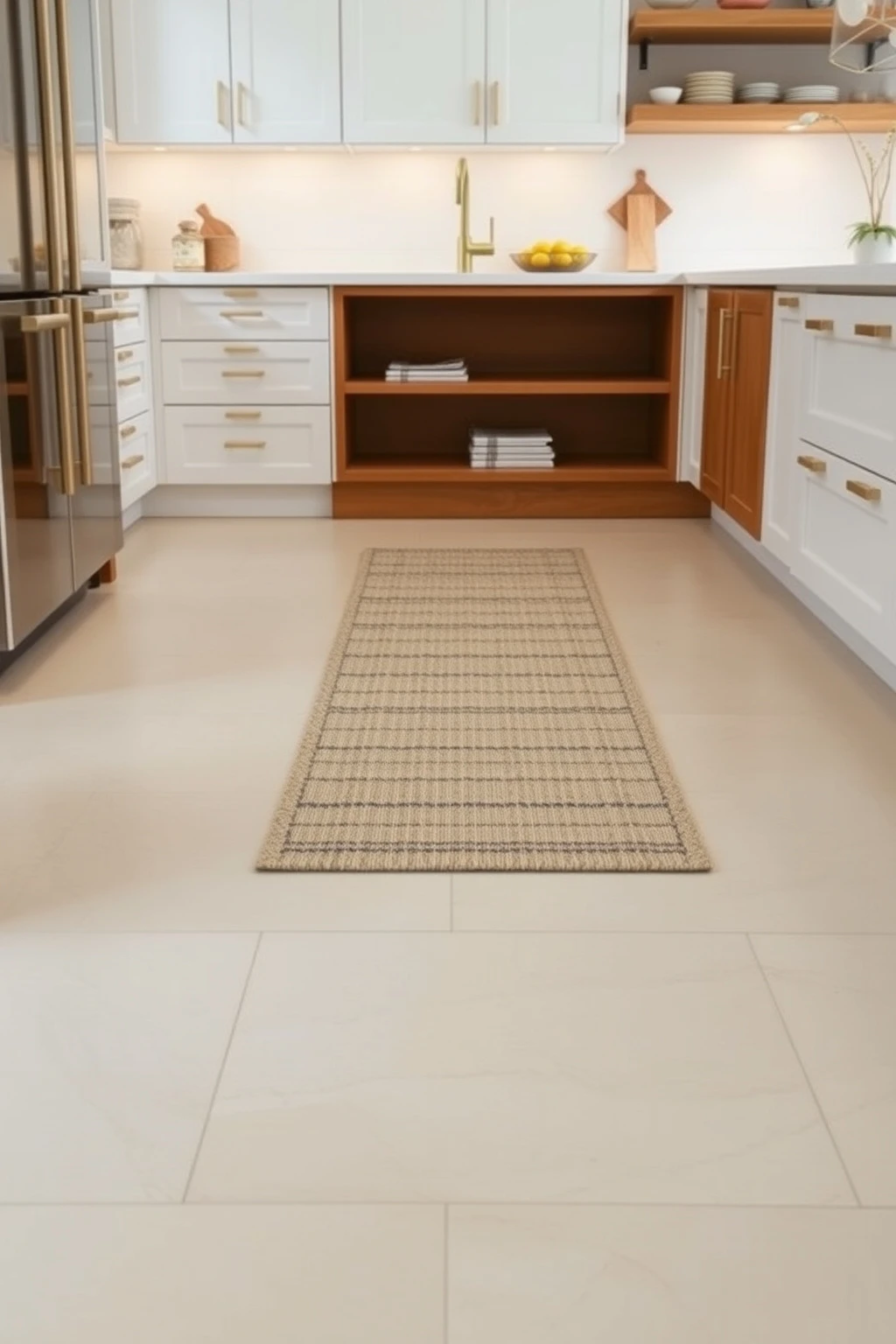
In a modern kitchen, a rug can add comfort—but the wrong placement will look sloppy. The trick is to use a kitchen runner with strong structure so it doesn’t curl underfoot. Also, don’t cover the entire floor; modern rooms like visible tile that shows off clean lines.
Choose a low-pile flatweave or tightly woven wool runner about 2 feet wide so it stays proportional to the cooking aisle. Run it centered in the traffic path under the sink-to-island route, but stop short of the fridge so the kitchen stays “open.” Use a rug pad with grip backing so it anchors firmly; skipping the pad is the most common reason rugs look untidy in practice. For color, consider greige or black-and-warm-ivory micro patterns to hide cooking splatters without turning the room dark.
Use a warm white palette that doesn’t go yellow on you
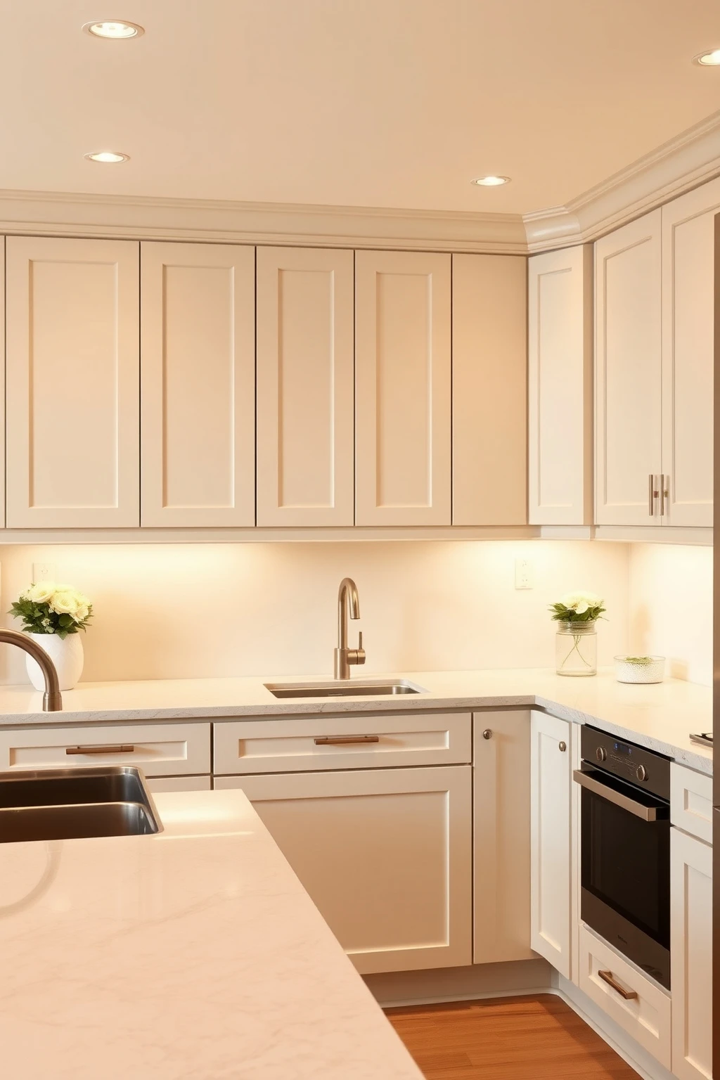
Warm whites are the go-to for modern kitchens—until you pick the wrong undertone and it turns dingy or peachy. If you want “clean and expensive,” you need warm white paint and materials that coordinate in real daylight, not just sample-card lighting. This matters most in kitchens with north-facing windows.
Ask for a test board and view it at 9 a.m. and 4 p.m. Choose a warm white that reads creamy, not buttery—think warm ivory (not pale yellow). Pair it with hardware in champagne bronze or brushed brass to keep the undertone cohesive. For countertops, consider warm veining quartz in ivory or soft greige rather than stark white marble-look that can feel cold. Then keep your backsplash slightly warmer than your cabinets—one step warmer is enough to prevent that “gray shadow” effect.
Incorporate a patterned moment—then ground it with solid neutrals
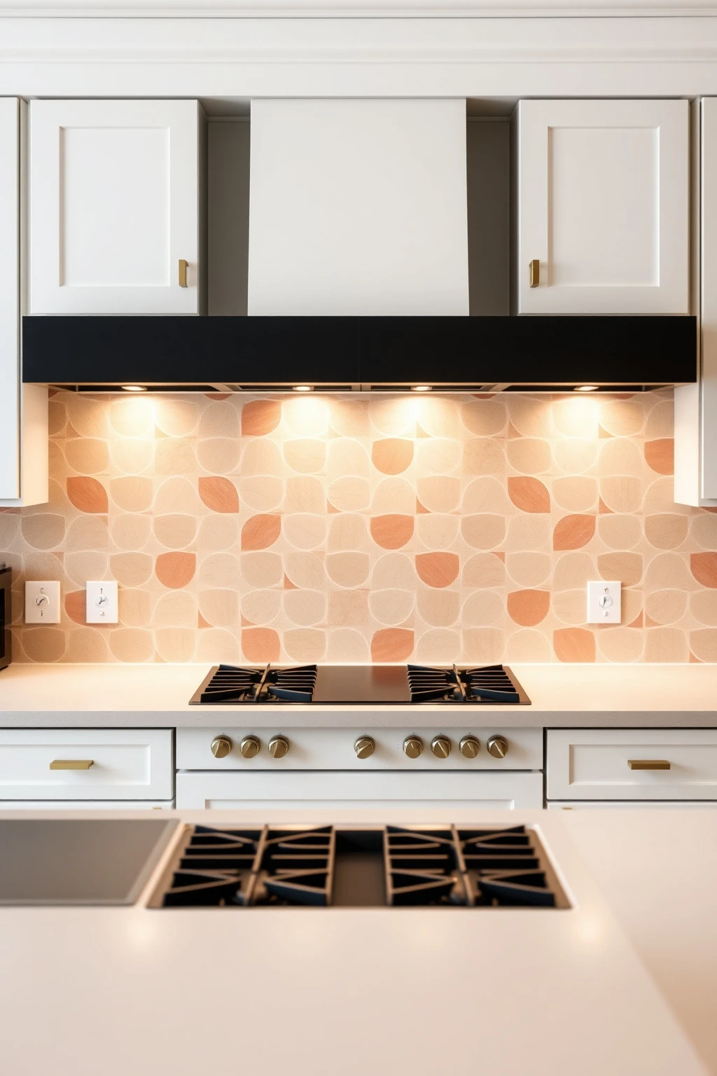
Many modern kitchens go completely neutral and end up looking like a blank set. One pattern can add personality, but only if you anchor it with solids so the room doesn’t feel “decorated” instead of designed. The win is using pattern in one vertical or surface plane, not everywhere.
Try a patterned backsplash in a single area behind the range—like a Spanish-inspired encaustic look porcelain in muted terracotta and soft cream. Keep the cabinets and counters solid: warm white cabinetry and warm ivory quartz. If you choose patterned tile, keep grout either a warm off-white or light greige so it doesn’t sharpen the design into something harsh. Finish with plain textiles: linen runner or simple roller shade in oatmeal so the pattern stays the focal point.
Pick a faucet finish that ties the metals together
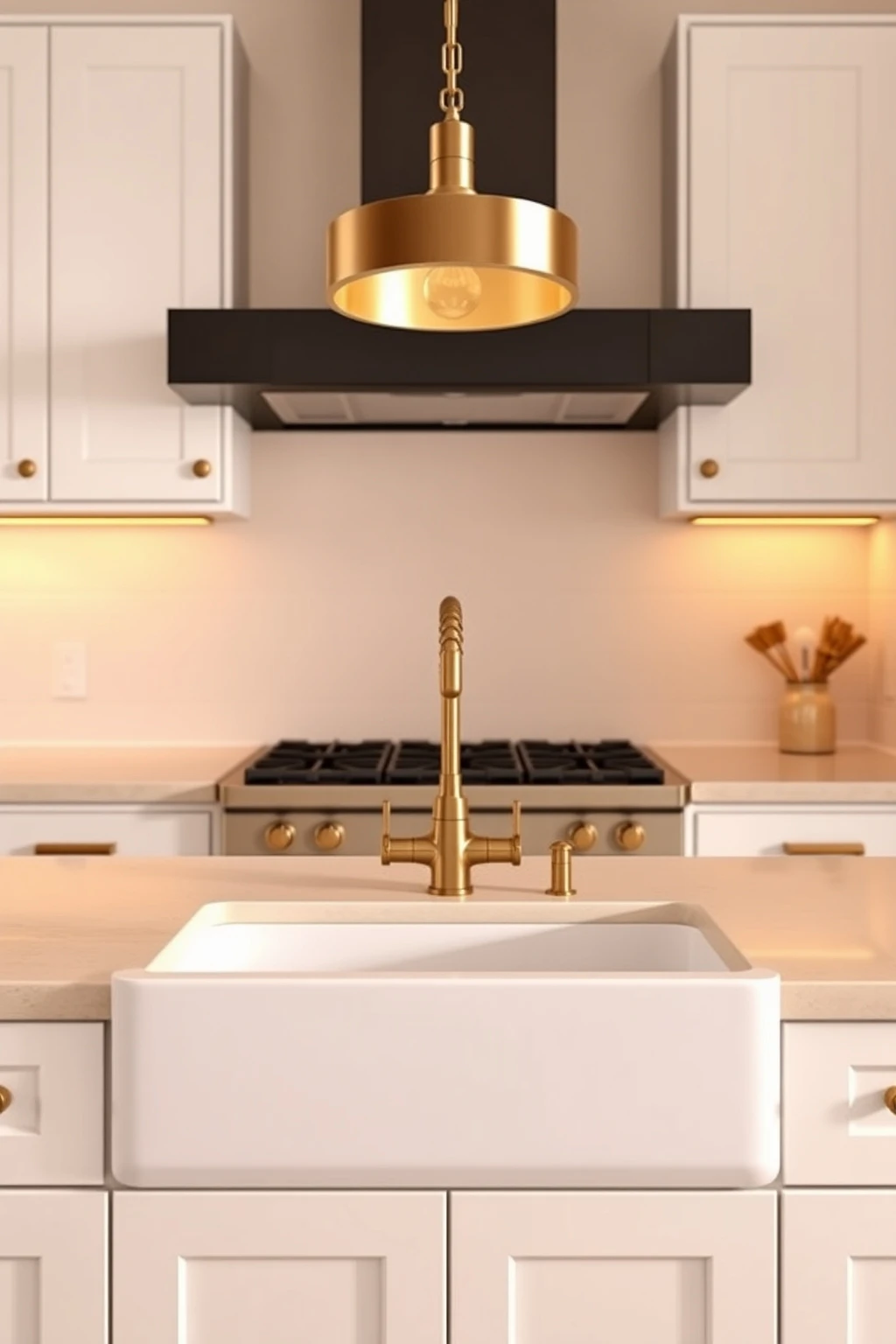
Metals mismatch is the most common “why does my kitchen feel off?” problem I see. A modern kitchen usually has one dominant metal tone and one supporting tone. Your faucet is the first metal your eye meets every day—so it should lead, not lag.
Choose a faucet finish that matches your cabinet hardware about 90% to 100%—brushed brass with brass pulls, chrome with chrome, etc. If you want a trendier modern look, try brushed champagne bronze for both faucet and light hardware accents. Then keep lighting metal consistent: pendant hardware, cabinet hinges if visible, and vent hood trim should all match. Avoid mixing too many finishes in small kitchens because there’s not enough wall space for the eye to reset between tones.
Install drawer organizers in a real order, not a pretty one
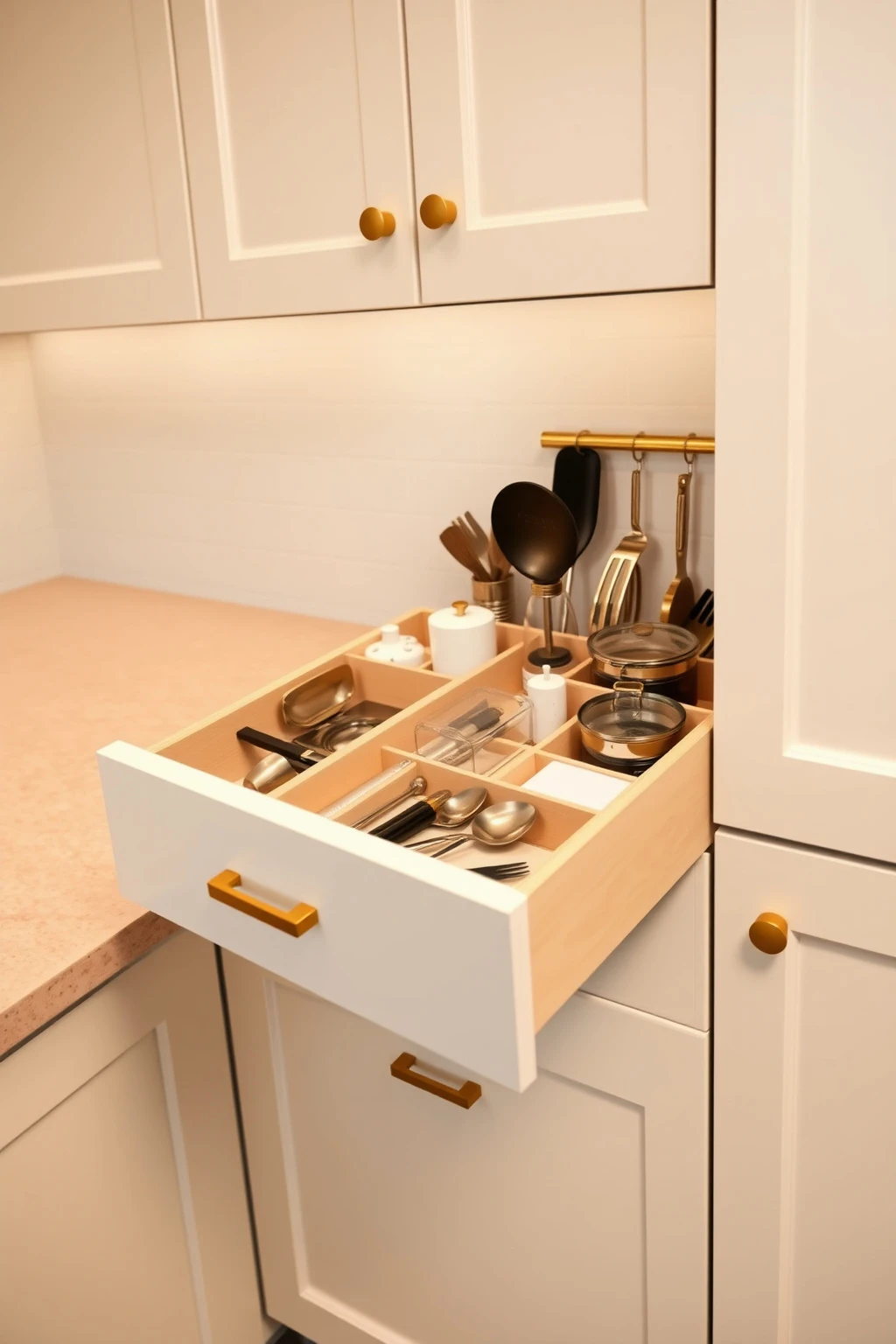
Organizers look great in a showroom tray set, but your kitchen drawers need to match how you actually cook. If utensils and gadgets live in random pockets, you’ll end up with countertop sprawl again. Modern kitchens stay clean because storage is logical and easy to reach.
Start by grouping by frequency: daily tools in the first drawer reach zone, backup tools in deeper drawers. For most kitchens, keep everyday cutlery 18–22 inches from the prep area, and put heavier items like mixing bowls closer to the floor-level cabinets. Use a 3-section system for drawers: one side for utensils, one for tools like peelers and microplanes, and one for “wrap” items like foil and parchment. Measure your drawer interior width and choose organizer modules that leave 1–2 inches of spacing so they don’t jam when humidity changes slightly.
If you’re tight on space, go for a slim prep bar instead of a full island
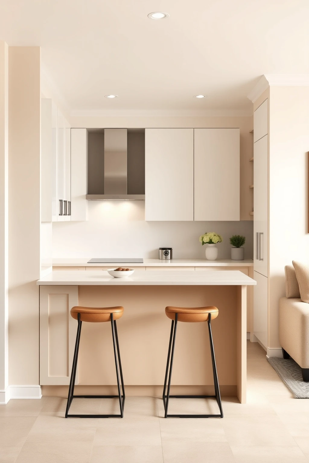
A full island can be a gorgeous idea that doesn’t fit your floor plan—and then you lose circulation, which makes everything feel less modern. In small kitchens, a slim prep bar gives you surface and storage without blocking traffic. It’s the difference between “designed” and “constipated.”
Aim for a bar width of 24–30 inches, with a depth of about 18 inches if it’s mainly prep-focused. Keep clearance around it at 40 inches minimum; if you can, go 42–45 inches for a more relaxed pass. Add a drawer bank on the kitchen side and open shelving on the wall side so you can store cookbooks or bowls without adding bulky upper cabinets. Finish with a waterfall end in a lighter stone—just one edge—so the bar feels intentional even when it’s compact.
Choose a cabinet paint sheen that matches real life
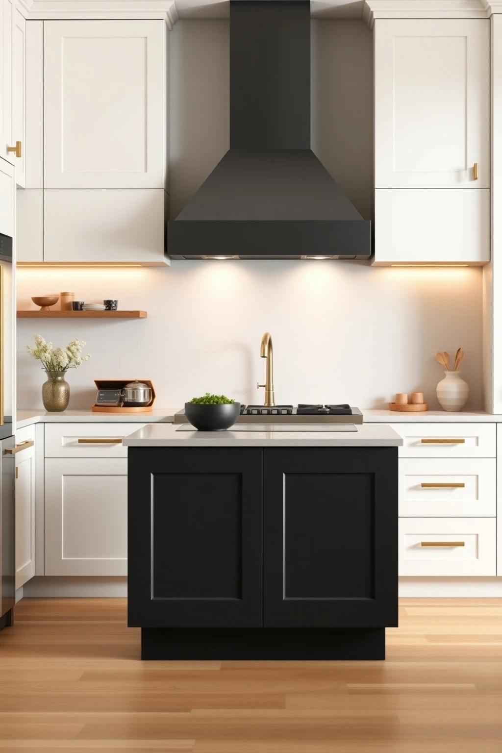
Cabinet sheen is one of those details you can’t guess from Pinterest. High-gloss may look modern, but it shows fingerprints and hand smudges like a spotlight. Matte hides imperfections but can look flat and chalky if you don’t pick the right paint.
For most modern kitchens, use satin or eggshell for cabinet finishes—satin on cabinets keeps it wipeable, eggshell for walls keeps walls soft. If you have kids or heavy cooking, choose a paint system labeled for cabinets with a washable finish; your future self will thank you. On a two-tone kitchen, keep the island a slightly glossier finish than the uppers to differentiate surfaces subtly. Always test sheen on a scrap board and let it dry fully—wet samples lie.
Use recessed shelves to add depth without adding clutter
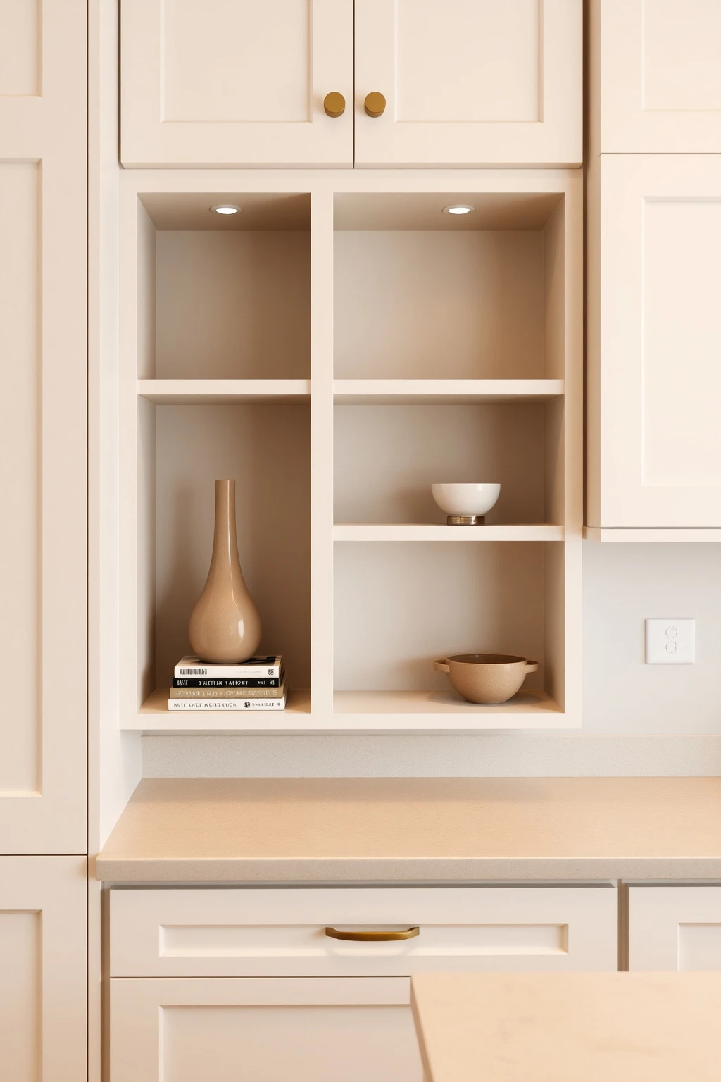
Instead of adding more furniture-like storage, recessed shelves create depth and make a modern wall feel custom. They’re perfect for a kitchen wall that’s currently just paint and hard corners. The design principle is simple: depth creates interest, and interest distracts from the lack of square footage.
Plan recessed niches around 6–10 inches wide and 10–16 inches tall so items look intentional, not like random cubbies. Keep the niche spacing consistent—either center them at 48–54 inches from the floor for easy reach or align with your countertop edge height. Style with one vertical element per niche (a tall vase or stack of cookbooks) and one low, calm object (a ceramic bowl). Finish the niche interior in a material that wipes easily, like sealed paint in warm gray or a light-colored backer tile.
Add a statement hood, even if the rest is quiet
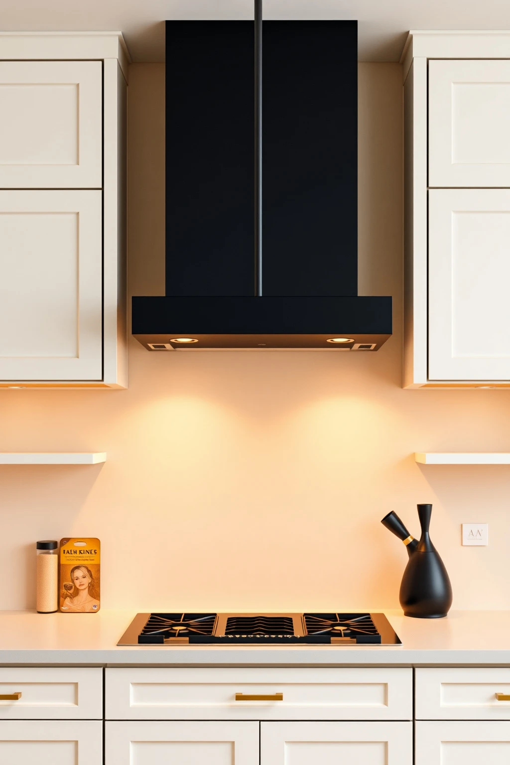
A range hood seems like a functional add-on until you choose the wrong shape and finish—then it becomes the loudest thing in the room for all the wrong reasons. Modern kitchens feel cohesive when the hood ties into the cabinetry line. You can also use it as the single statement so the rest stays understated.
If you want a sleek, modern look, consider a chimney-style hood with a flat front and subtle detailing, finished in matte black or brushed brass. Keep its width proportionate to the cooktop: typically the hood should be at least as wide as the cooktop, often 1–3 inches wider. Install it at the manufacturer-recommended height, then frame the sides with matching paneling so it visually “sits” within the cabinetry. Finish with simple lighting inside the hood or a nearby wall sconce so you get task light without overhead glare.
Rethink lighting layers: pendants + toe-kick + task spots
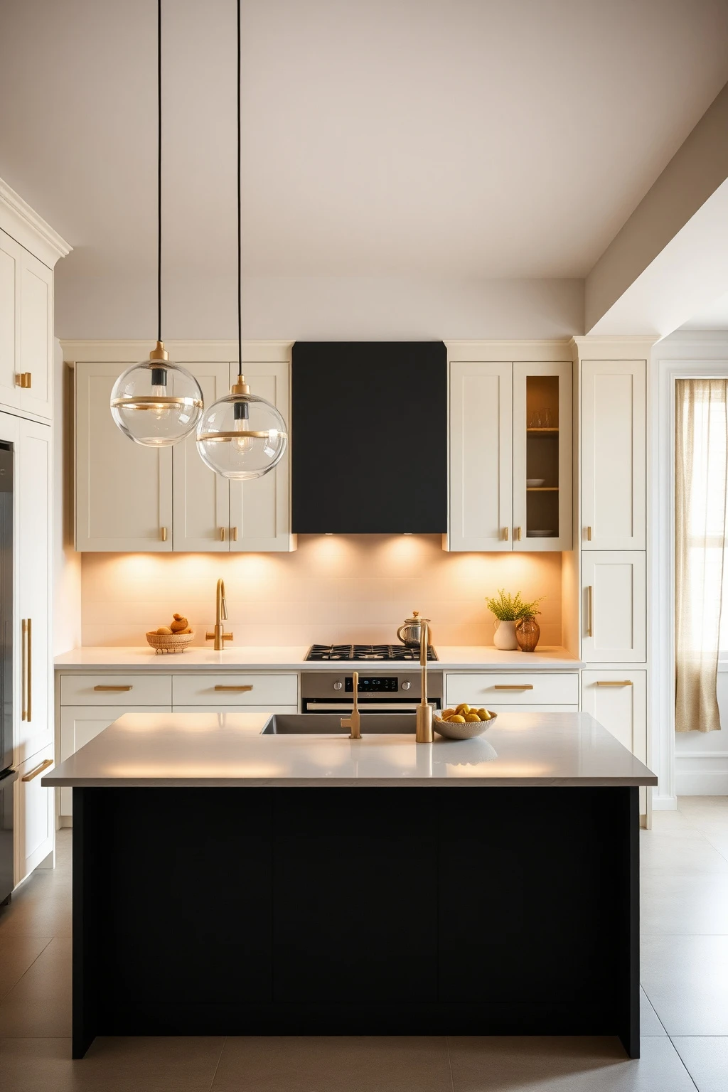
Modern kitchens look polished because they’re lit in layers, not because they’re bright. Overhead lighting alone flattens the island and makes shadows under cabinets look harsh. When you add lighting at different heights, the room feels dimensional and expensive.
Use pendants over the island for style, under-cabinet LED for prep, and toe-kick LED or subtle cove lighting for softness under base cabinets. For pendant scale, keep the bottom of the fixture about 30–36 inches above the countertop so it doesn’t feel like a low ceiling threat. Add one dedicated task light over the prep zone if you have a dark corner—something adjustable or a small track head works well. Keep all lights within a consistent color temperature range (again, 2700K–3000K is the sweet spot) so whites don’t look blue next to warm metals.
Give your kitchen an intentional color story with two-tone cabinets
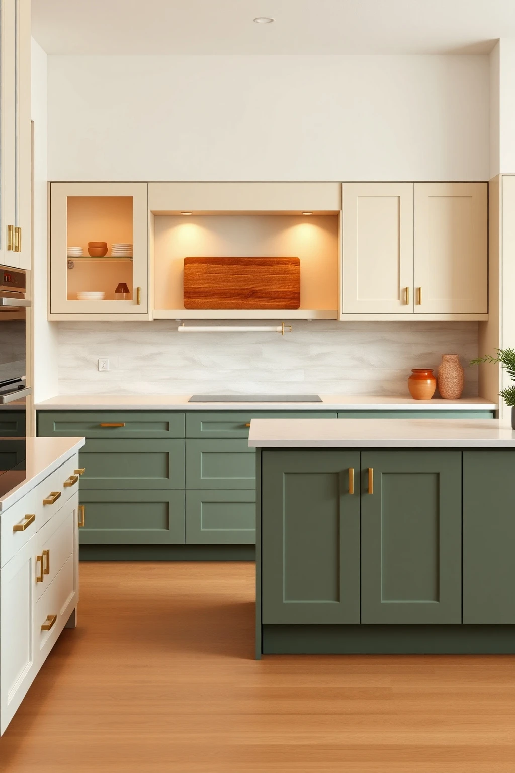
Two-tone kitchens don’t work when they’re random. The modern approach is to use one color for the “structure” and another for the “focus,” so the room reads instantly. If your eye can’t tell what the main character is, it won’t feel modern—just mixed.
Try this: keep the perimeter cabinets warm ivory and paint the island in a grounded color like sage green or charcoal. Choose one “bridge” accent in between—brushed brass, warm oak, or a terracotta-toned backsplash—to connect the tones. Keep cabinet doors in one sheen level so they visually match, and use the same hardware finish across both colors. If your kitchen is small, limit the darker color to the island and maybe one vertical element like a tall pantry door so the room stays bright.
Use a narrow appliance garage or open shelf to hide the daily clutter
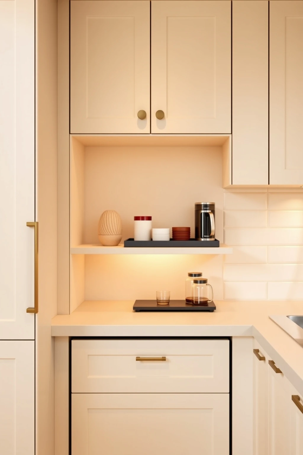
Counter appliances are necessary, but leaving them all out turns the kitchen into a temporary workspace. Modern kitchens feel like they have breathing room because you can clear the counters quickly. The move is a dedicated zone for daily “clutter” that blends in visually.
If you can’t build a full appliance garage, install a narrow open shelf unit above the counter with a simple door panel below or a curtain. Keep it 12–14 inches deep at most so it doesn’t eat the room, and leave the counter mostly clear when not actively using appliances. Group items in one tray per appliance—so when you wipe down, everything comes off at once. For renters, an easy alternative is a rolling cart in warm wood with a solid top; tuck it into a corner when guests come over to restore the clean lines.
Select countertops by maintenance: choose quartz for low-stress modern life
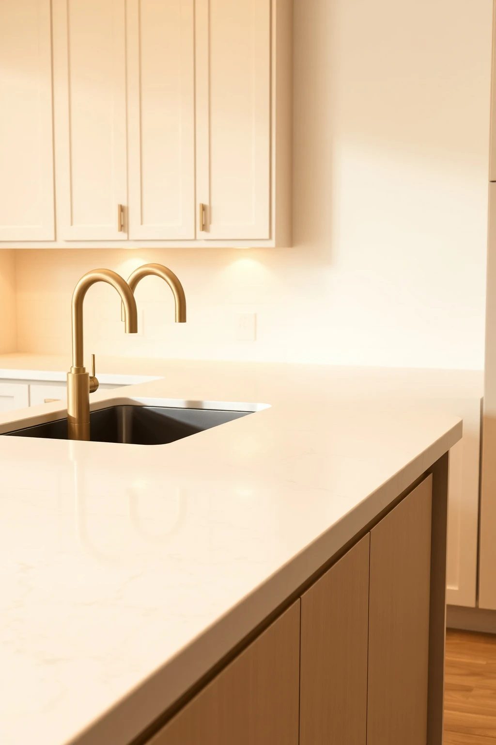
The most beautiful countertop is the one you can live with. If you choose natural stone without understanding sealing needs, your modern kitchen may end up looking dull from neglect. Quartz is popular in modern spaces because it offers consistent color and durability with less fuss.
If you want that seamless look, opt for quartz in warm ivory, light greige, or soft cream with minimal veining for a calmer, contemporary rhythm. Pair it with an undermount sink and a simple faucet for a clean silhouette—avoid ornate edges that interrupt the line. For grout lines and backsplash, choose matching tones so the countertop doesn’t feel like a floating block. If you’re on a tight budget, consider laminate in a realistic quartz pattern but upgrade the edge profile with a thicker-looking bullnose or a modern square edge to trick the eye into feeling more premium.
Conclusion
The most stylish modern kitchens don’t come from copying a look—they come from making smart choices that support how you move, cook, and store. When your lighting is layered, your materials coordinate, and your storage has rules, the whole room starts to feel effortless.
Choose one or two ideas you can act on this week (hardware scale, under-cabinet lighting, or an organized drawer system), and let the rest build from there. Your “dream cooking space” should feel good in real life, not just on a good day for photos.

Mush Decor
Writes about accessible, timeless interior styling for readers worldwide.
More about Mush DecorRelated articles
 Kitchen Ideas
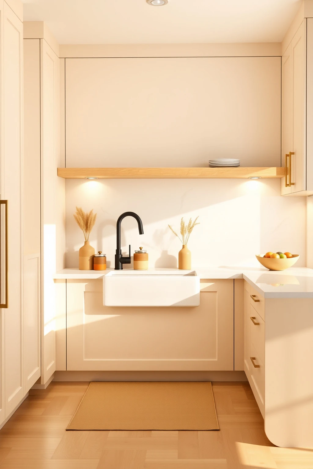
23 Beige Kitchen Ideas for a Warm Modern Look
Get warm, modern kitchen style with 23 beige design ideas—countertops, lighting, hardware, backsplashes, and lighting tips that actually work.
Read More