
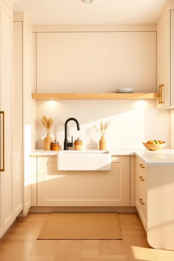
The first time you walk into a beige kitchen that feels truly warm, you can usually point to one thing: the light. Not the fixture—you mean the way the beige tones bounce around your counters, cabinets, and floor so the room never turns flat or chilly.
If your kitchen currently reads “beige” but not “inviting,” you’re not alone. Too-cool undertones, overly matchy finishes, and the wrong contrast between cabinets and counters are the usual culprits—and they’re fixable.
Below you’ll find 23 specific, doable ideas you can copy, from countertop pairings and backsplash textures to hardware finishes and lighting plans. Each one includes the design reason it works plus a practical way to implement it without guesswork.
Choose Warm-Ivory Cabinets (Not Beige-Wall Beige)
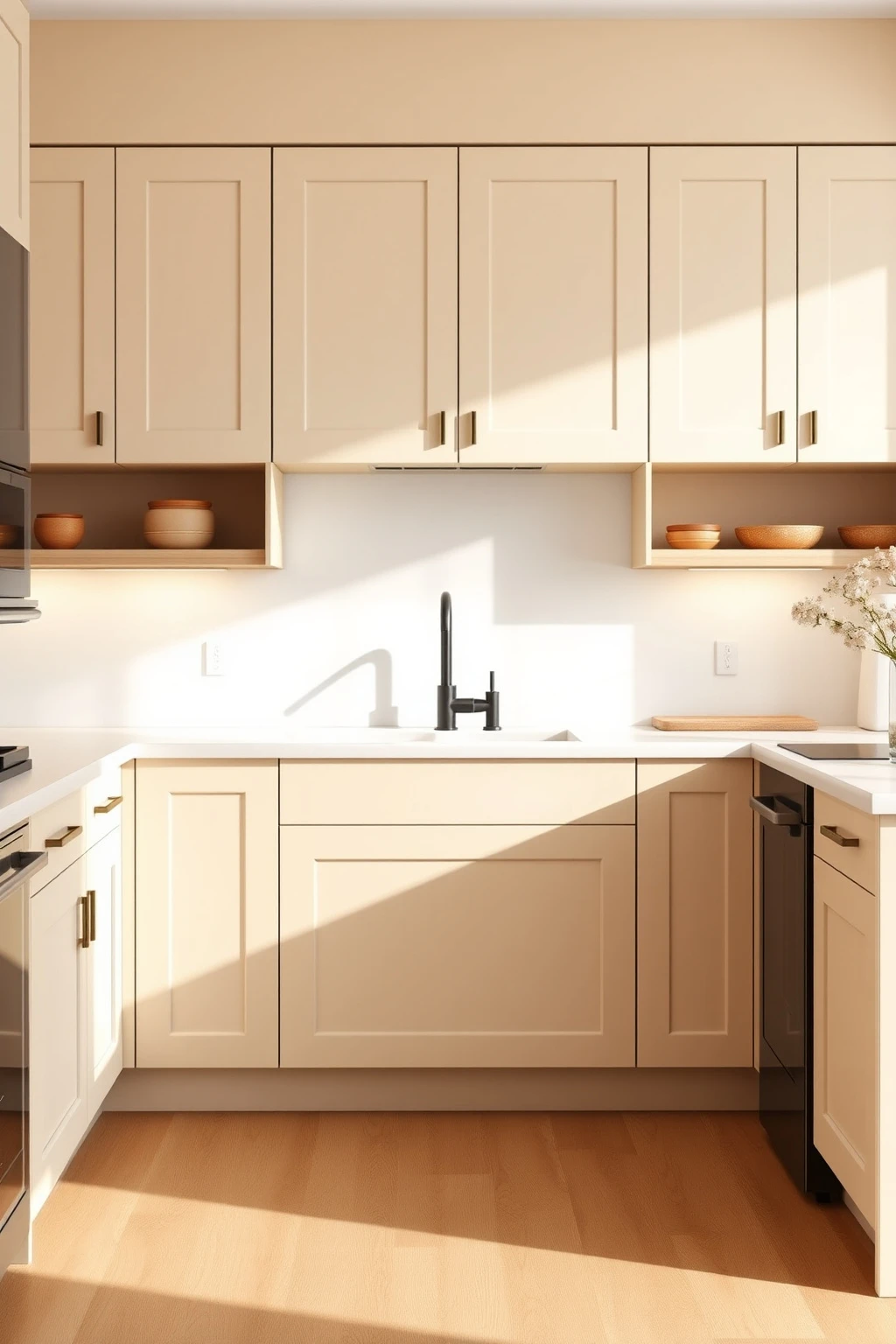
Beige kitchens go wrong when the undertone matches “cool office,” not “sunlit room.” If your cabinets look grey next to warm wood or creamy stone, you’ll feel that chill every time you open a drawer.
Ask for warm-ivory paint or stain samples that read more like cream than taupe. In a showroom, place your cabinet sample next to a warm oak board and a white paper towel—if it looks greener or ashier than the wood, keep moving. For a modern look, go for flat-panel or Shaker doors with a matte finish and a slightly chalky topcoat, like a Benjamin Moore “Swiss Coffee” vibe (warm white family). Then pair with countertops labeled warm white, not bright white, so the room stays cohesive instead of two-tone awkward.
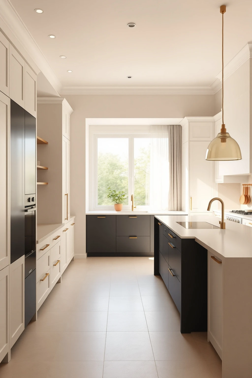
Add Contrast with a Charcoal Appliance Garage
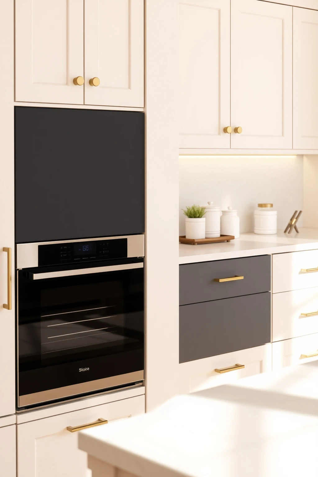
A beige kitchen doesn’t need to be “all beige” to feel warm—it needs contrast with intention. If everything is the same lightness, your eye can’t find edges, and the space starts to feel like a beige blur.
Instead, build or paint one grounding element in charcoal, like an appliance garage panel, a microwave niche surround, or the end panel of a built-in coffee station. Use a matte charcoal (not glossy) so it absorbs light and looks calm. Keep the charcoal piece roughly 20–30% of the visual mass in that zone, then echo it subtly with one smaller metal accent like a charcoal-tinted utensil crock. This gives you modern definition while protecting the overall warmth.
Use Honed Stone Backsplashes for a Softer Modern Texture
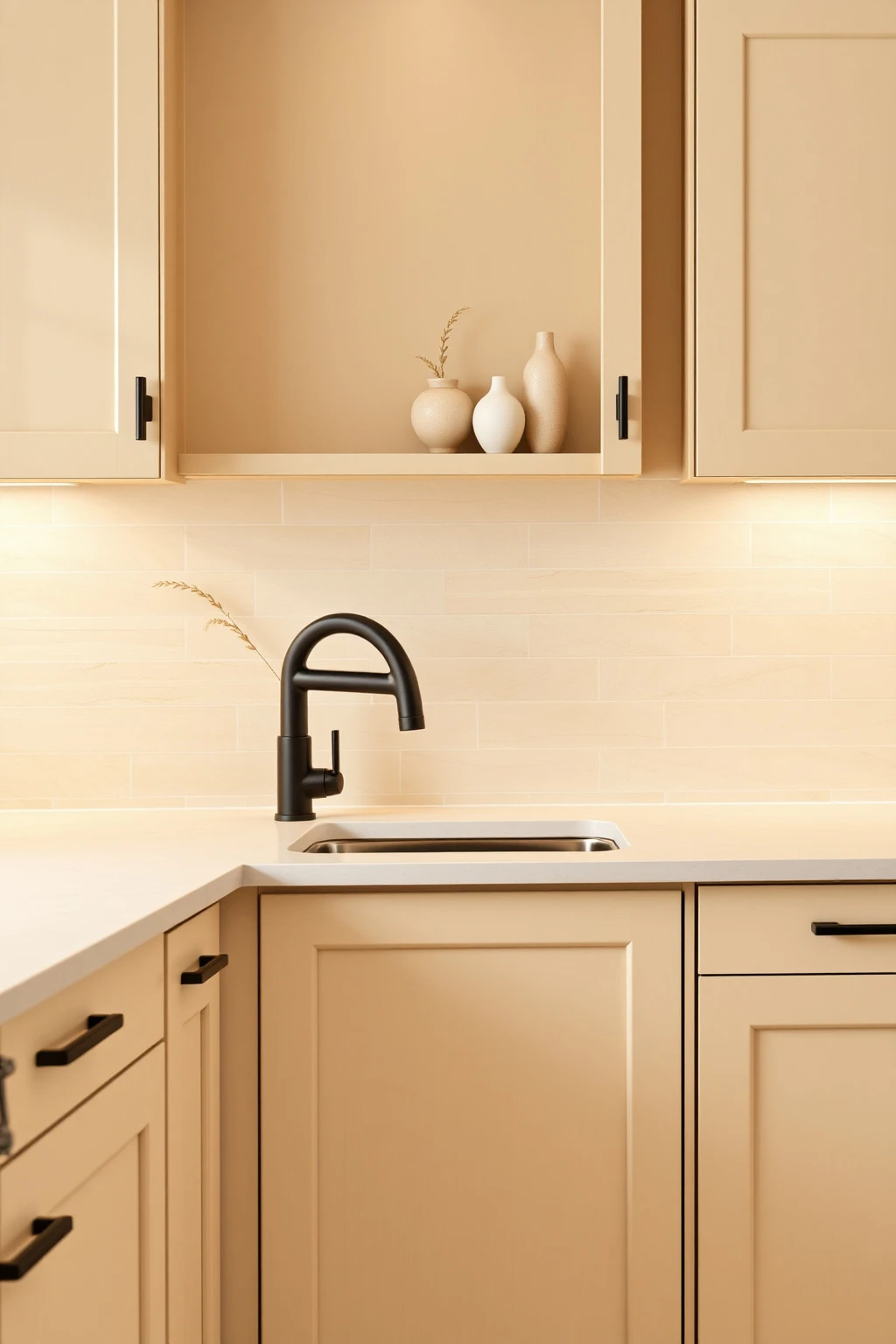
Glossy beige backsplashes often reflect overhead lighting back into your face, which can make a kitchen feel harsher than it looks. A honed or brushed stone surface diffuses light, so beige reads creamy instead of flat.
If you’re updating on a mid-range budget, choose honed travertine tiles in a warm ivory base with subtle speckling. Keep grout in a warm, sand-colored tone—if you use bright white grout with beige tile, the lines can look too “graphic” for modern warmth. For a tailored finish, install tiles with consistent direction (same vein flow) on the main run and use a simple bullnose or micro-bevel at edges. The texture becomes your design element, so you can keep everything else sleek.
Pair Beige Cabinets with Warm Wood Countertops (Teak, Oak, Walnut)
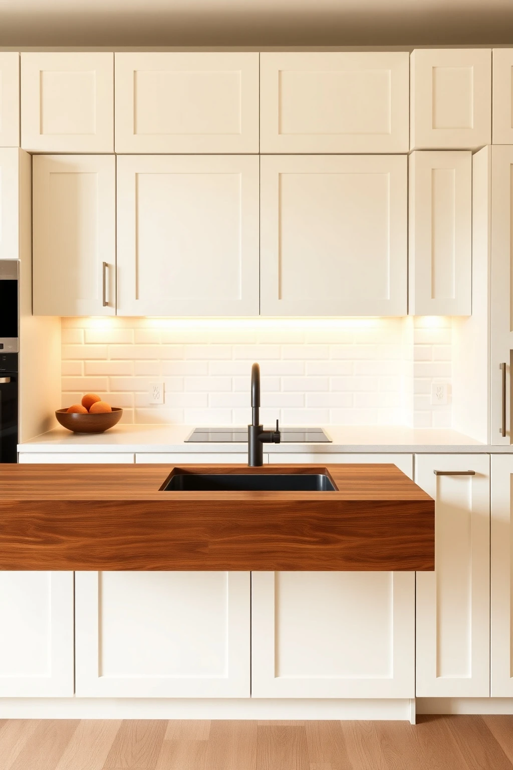
The secret to “warm modern” isn’t the color—it’s the material temperature. Beige + cold stone can read sterile, but beige + warm wood feels grounded and lived-in.
For a durable work surface, choose sealed butcher-block in medium walnut or oiled teak (not unfinished craft wood). If you want a lighter feel, use whitewashed oak with visible grain and keep the finish matte, not glossy. Match your cabinet undertone to the wood—warm ivory cabinets with walnut/oak, and slightly darker beige/taupe cabinets with teak. Seal with a food-safe finish and reapply oil yearly; your kitchen will look richer as it ages instead of turning patchy.
Pick a Beige That Matches Your Light Direction
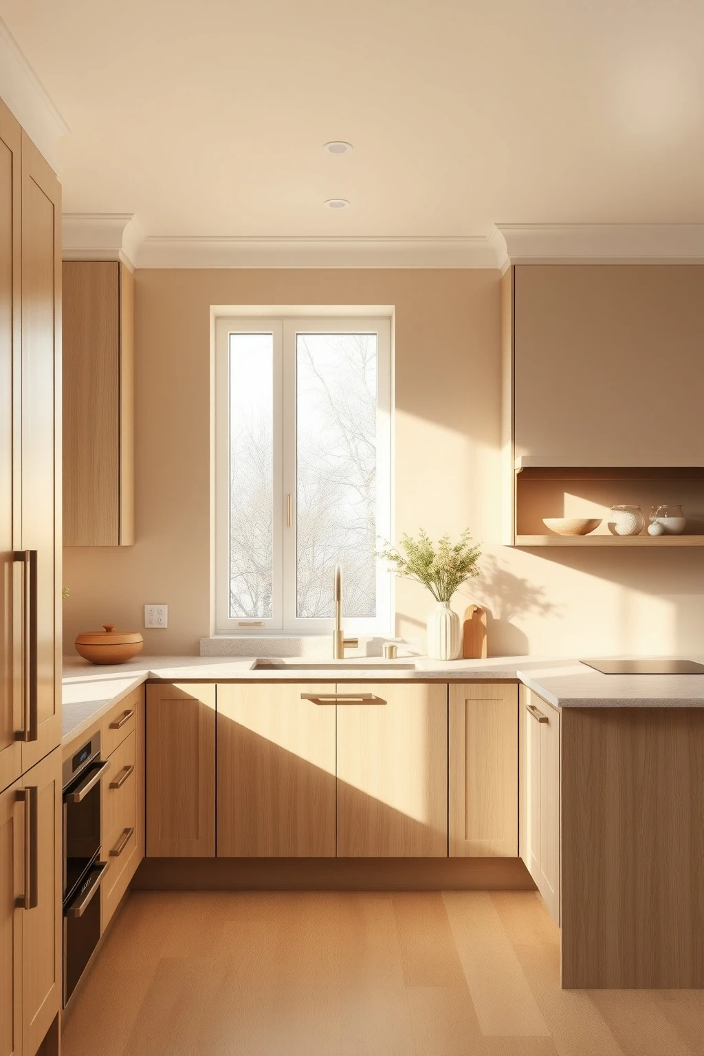
North-facing kitchens can steal warmth from beige and turn it slightly grey by late afternoon. South-facing kitchens can do the opposite, making beige look almost golden—so the “right” beige in one home might feel wrong in yours.
Test paint samples at two times: 9 a.m. and 4 p.m. Tape a 12-inch square sample near the countertop height, not on the ceiling where light behaves differently. For north light, lean toward beige with a peachy or creamy undertone (think “oat milk” rather than “sand”). For south light, choose beige that has a touch of greige or taupe so it doesn’t go too yellow. This one step prevents the common mistake of repainting because “the sample looked perfect.”
Go Matte on Hardware, Not Glossy
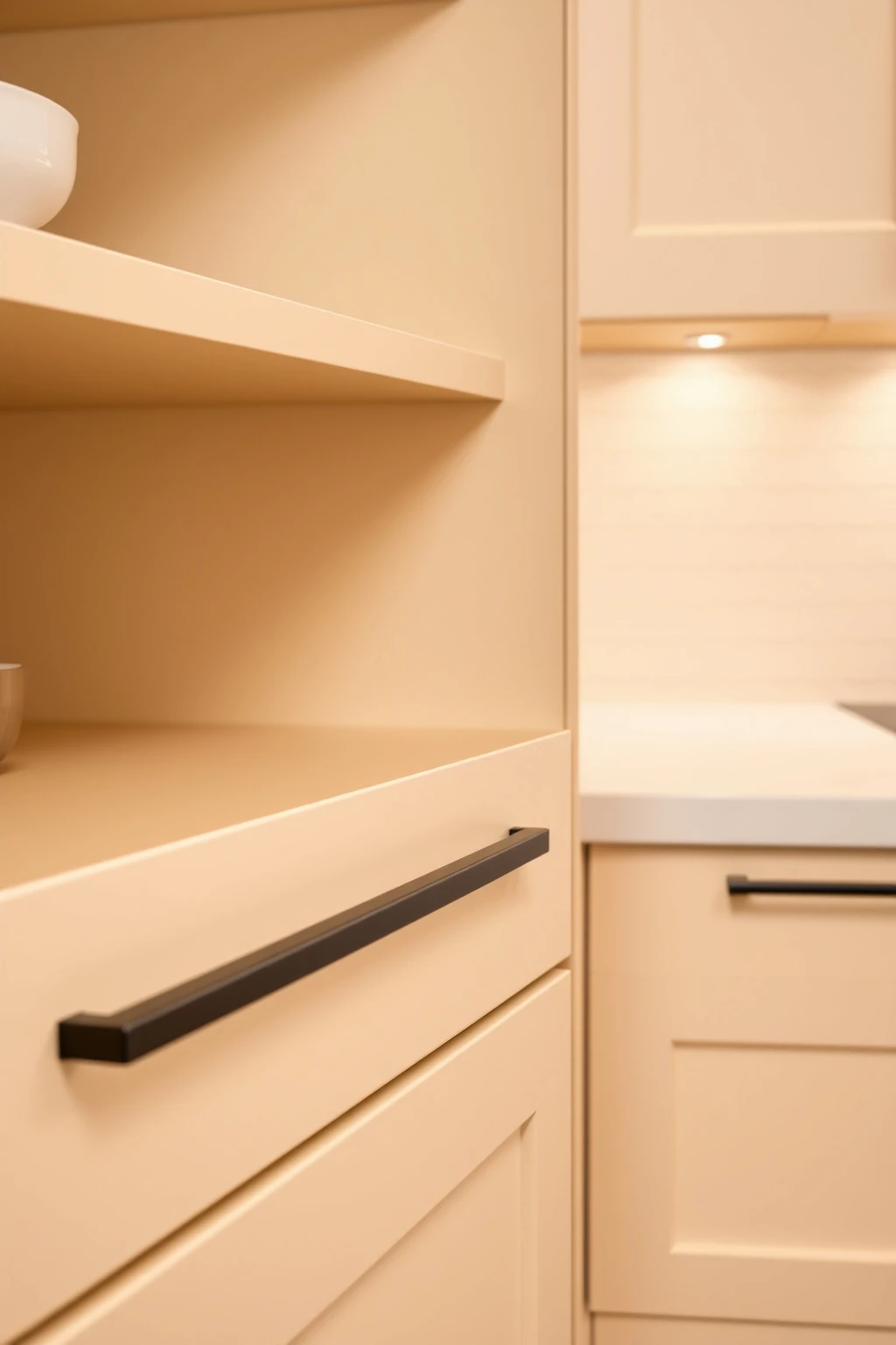
Beige kitchens show texture. Glossy hardware reflects light sharply, which can make beige look “flat” and cheap by comparison.
Choose matte finishes like brushed brass, brushed nickel, or matte black depending on your undertone. If your cabinets are warm ivory, brushed brass often flatters the cream tone better than shiny brass. For a modern feel, keep pulls and knobs slim—around 1.25 to 2 inches for long pulls—and install consistently aligned (measure from drawer centers, not eyeballing). The practical trick: order a single drawer pull and test it under your cabinet lighting; if you see harsh glare, switch to a matte finish.
Layer in Warmth with a 2–3 Color Countertop Plan
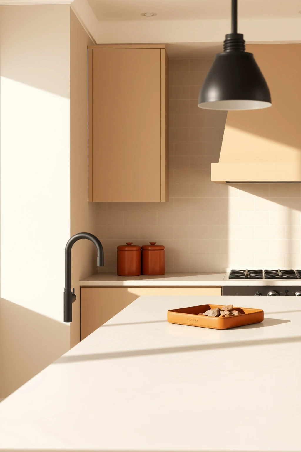
Beige can look sophisticated—or it can look like a single-note soundtrack. The way to fix that is to let your countertops and backsplashes bring in two complementary neutrals that don’t fight.
Look for a countertop with warm movement: quartz with cream base and faint tan veining, or a limestone with slight honey undertones. Then keep backsplash tile in either the same family (warm ivory) or one step darker (light camel) so the transition is natural. Add one small “third” color via accessories—terracotta, cognac, or olive—so your kitchen feels styled, not staged. Avoid the mistake of using bright white everywhere; that third color should be warm and grounded, not stark.
Install Under-Cabinet Lighting at the Front Lip
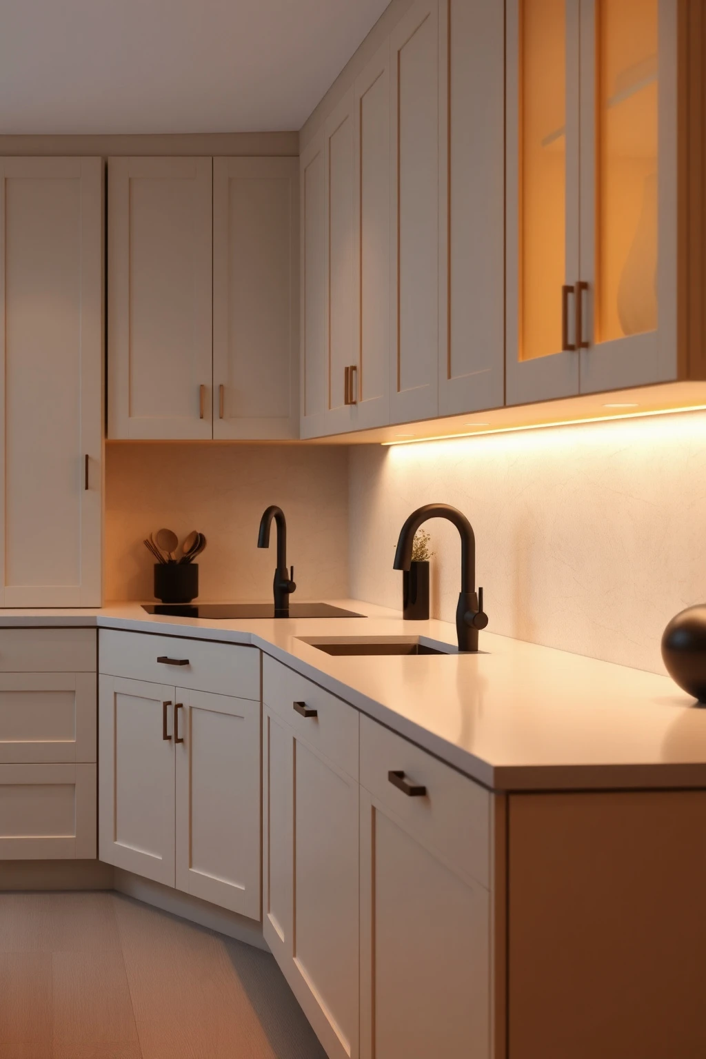
Beige surfaces look best when light grazes them. If your under-cabinet lights are aimed too high or too far back, you’ll get shadows in the corners and a flat, unflattering beige sheen.
Place LED strips or puck lights so they wash the counter area and create a soft highlight along the cabinet fronts—roughly 2 inches from the cabinet face edge. Use a warm color temperature (around 2700K–3000K) to keep beige creamy rather than grey. Consider diffusers to avoid visible LED dots; you want a smooth “glow,” not hotspots. Then check at night by turning off the kitchen overhead light—if the counters still look warm and your backsplash texture shows depth, you nailed the angle.
Use a Beige-and-Tan Rug to Soften Traffic Flow
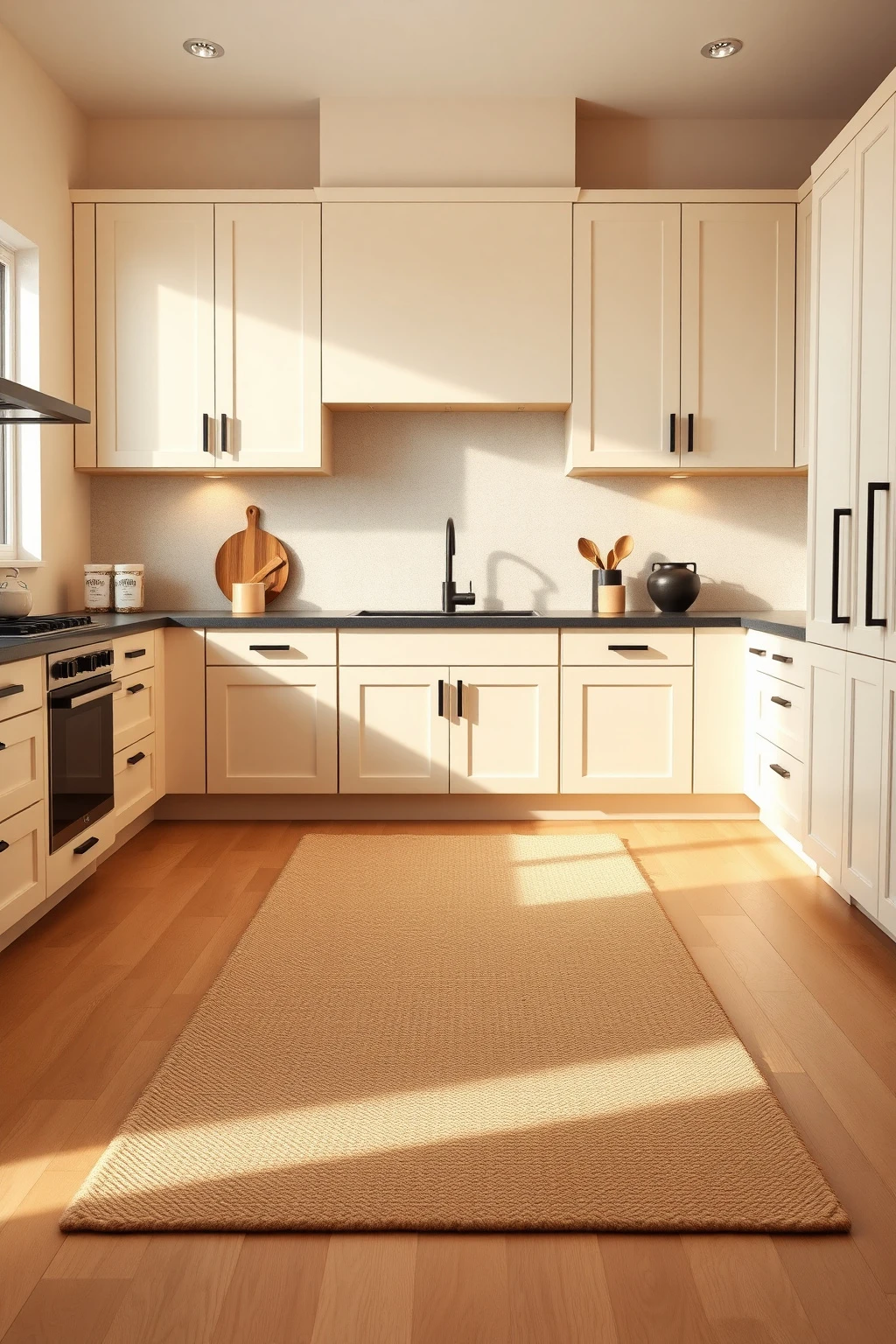
Hard floors plus beige cabinetry can make your kitchen feel echo-y and visually rigid. A rug is how you slow down your eye and your footsteps without adding “more stuff.”
Choose a low-pile indoor rug in a beige-and-tan pattern with subtle contrast (jute-like texture or small broken stripes). Position it so it extends 8–12 inches beyond the sink and 18–24 inches in front of the main prep zone. If you have an open layout, align the rug direction with your dining table edges for visual continuity. Common mistake: picking a high-contrast black-and-white rug—too much contrast in a beige kitchen can feel jarring and busy.
Create a ‘Beige Frame’ with Dark Window Trim
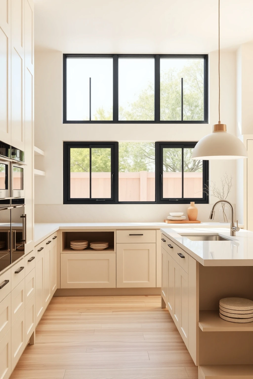
If your kitchen has big windows, the frame around them is your chance to add structure. Dark trim makes beige read more intentional—like it’s designed, not accidental.
Paint window and door trim a deep charcoal or espresso brown, then keep walls a warm ivory or greige that’s not too saturated. This works especially well with larger beige cabinets because the dark border gives your eyes a place to rest. Use semi-gloss on trim so it wipes clean after cooking splashes. For a modern approach, keep interior casing simple—no ornate profiles—so the contrast feels contemporary, not traditional.
Upgrade to Soft-Edge Tile (Micro-Bevel or Rounded Profiles)
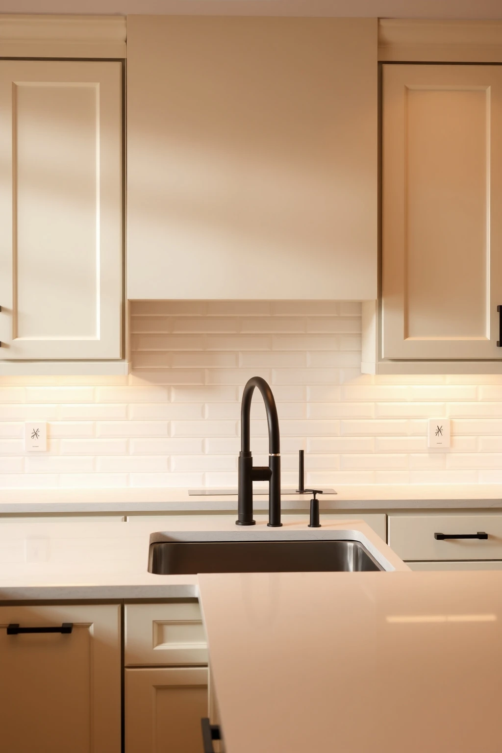
Sharp corners in beige kitchens can make the whole space feel more industrial than you want. Soft-edge detailing on tile trims reads modern and “friendly” at the same time.
If you’re using subway tile, choose a micro-bevel edge or a subtle rounded profile so the grout lines don’t look razor-straight. Pair it with warm white grout (sand-leaning) instead of bright white; it keeps everything cohesive and prevents the common “grid” look. For a clean modern moment, lay subway tiles in a simple stack pattern on the main backsplash and use offset only on the side returns. You’ll get depth from the bevel and less harshness from grout contrast.
Keep Your Island One Step Darker Than Your Perimeter
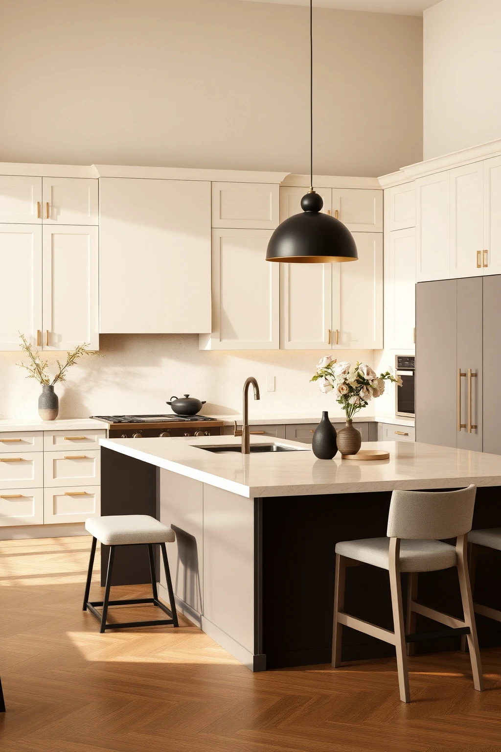
When everything is the same beige, your kitchen can feel flatter than it actually is. A simple tonal shift adds depth and gives you a natural focal point for everyday living.
Paint or finish your island in one step deeper—think warm taupe or light greige—with the perimeter cabinets staying warm ivory. If you’re using wood, choose a darker stain on the island top or island cabinetry only, such as walnut-stained oak. Keep the countertop consistent across both zones if possible, so the tonal difference comes from cabinets, not random stone. This is a practical trick for open-plan homes: the island anchors the space without needing dramatic colors.
Try Beige Textiles with ‘Earthy’ Contrast (Olive, Terracotta, Oat)
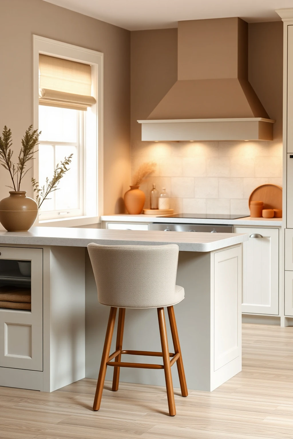
Your kitchen’s beige palette gets more believable when you introduce one earthy color through fabric. It’s a fast way to make the room feel styled even if your cabinets stay neutral.
Add an olive or dusty terracotta element through bar stools (choose linen or boucle upholstery) or a roman shade in oat-beige. Keep the pattern subtle—look for woven textures, tiny flecks, or a very small repeat. A common mistake: bringing in a bright red or cool grey fabric, which can make beige feel tense. Instead, match undertones: if your beige reads creamy, terracotta and oat behave like warm partners. Aim for one textile at a time so you don’t overload the room.
Make Open Shelving Feel Modern with Uniform Objects
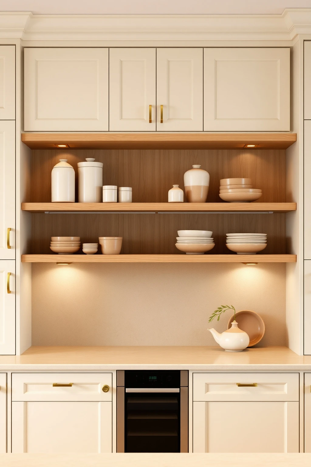
Open shelving in beige kitchens can quickly turn cluttered, especially if you’ve got mismatched canisters and random jars. The trick isn’t to hide shelves—it’s to control repetition.
Use uniform ceramics in two tones: warm cream glaze and sand or cognac brown. Vary height with a stack of two bowls (one larger, one smaller) next to a tall vase, but keep everything within a narrow palette. If you want extra polish, add thin shelf brackets in brushed brass or matte black so the hardware echoes your cabinet pulls. Keep what’s visible in the “show zone” to about 60% full; the empty space is what makes it feel designed, not chaotic.
Choose a Beige Grout Tone That Matches Your Tile Movement
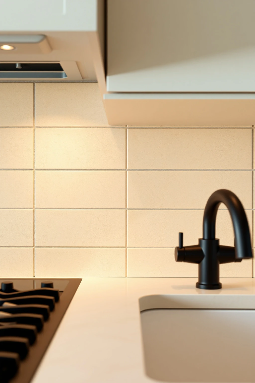
Most beige kitchens look “off” because grout creates an accidental stripe across the room. White grout with warm ivory tile can make lines too stark, especially under overhead lighting.
If your backsplash tile has warm undertones, choose grout labeled sand, oatmeal, or warm beige—even if the sample looks slightly darker than you expect. For tiles with speckling, match grout to the dominant base color rather than the lightest specks. Use a grout release if you’re worried about staining from cooking, and seal porous stone before grouting. When it’s right, the backsplash reads like one soft surface, and beige feels cohesive instead of segmented.
Go for a Warm White Ceiling with Beige Walls
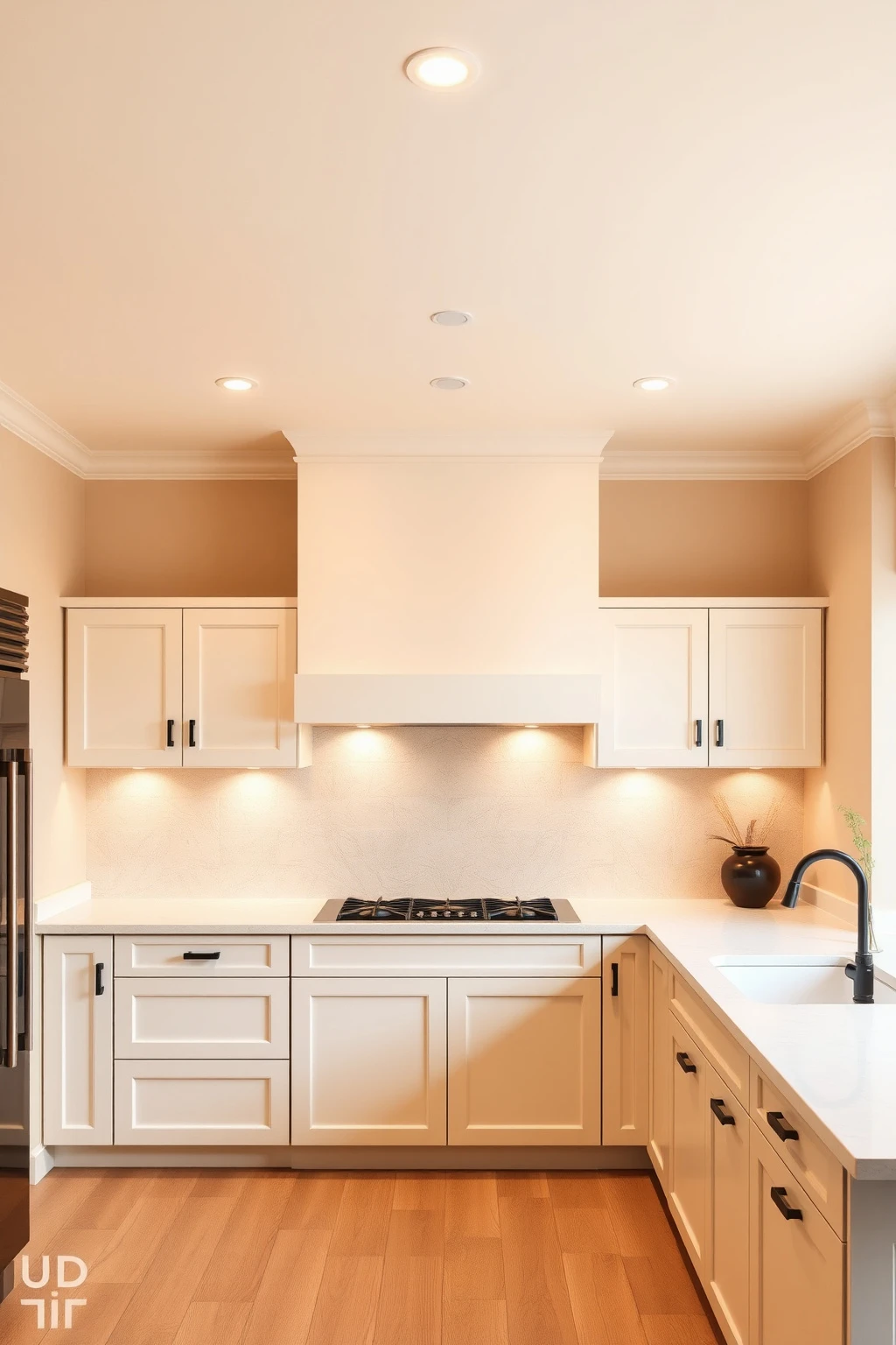
If your ceiling is bright white while your walls and cabinets are beige, the room can feel top-heavy and slightly cold. A warm white ceiling helps beige look creamy instead of smoky.
Paint the ceiling a warm white (the same family as your trim), not a stark blue-white. If you’re not sure, compare samples against a printed piece of “bright white” paper—your goal is a softer off-white that won’t look yellow, just warm. Keep wall paint slightly deeper than the ceiling so you still get dimensional separation. This is especially helpful in kitchens with low ceilings: warm ceilings visually lift the room, making the beige palette feel expansive.
Install a Creamy ‘Warm White’ Quartz with Subtle Veining
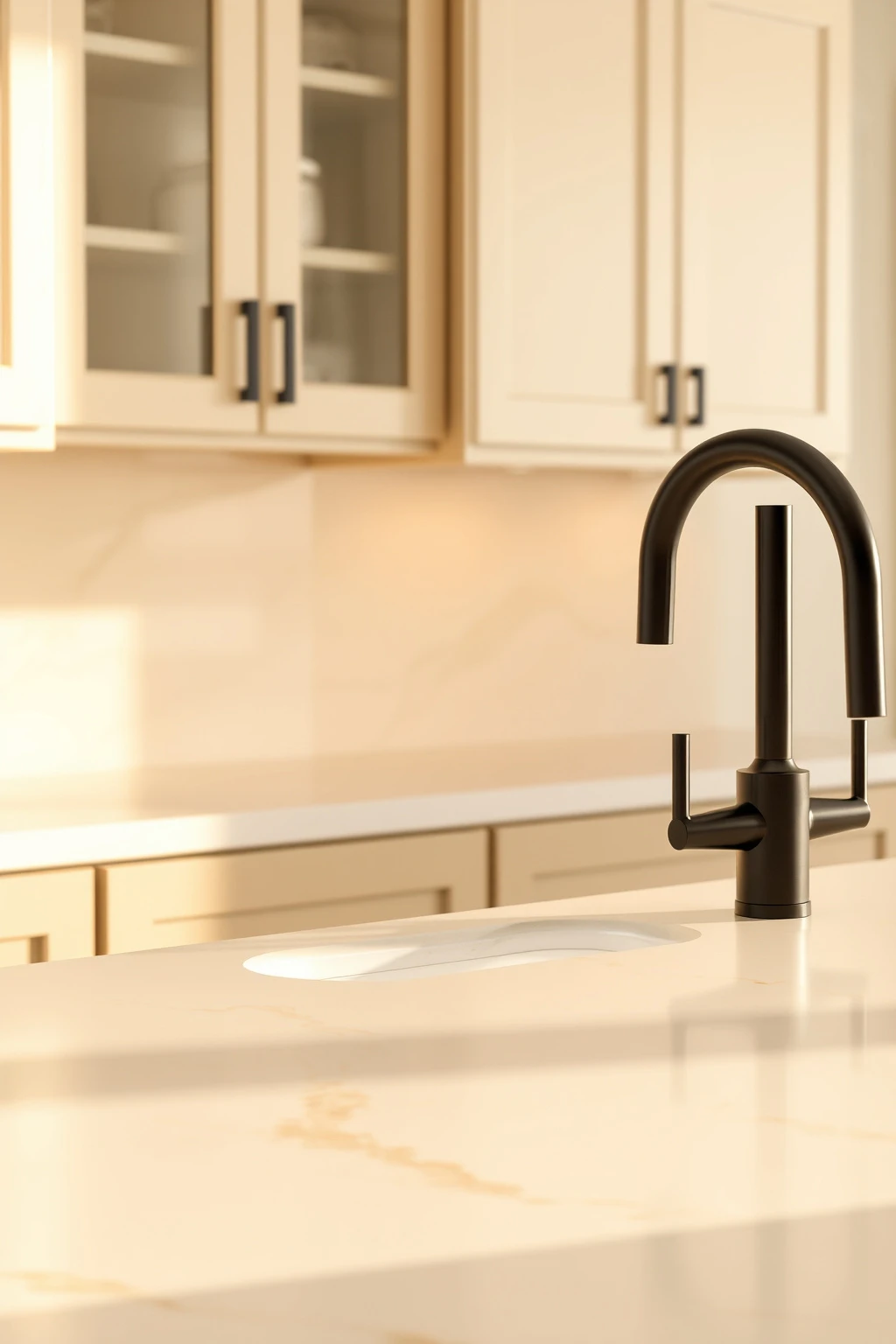
Not all white quartz is the same. Some reads bright and clinical, and it can make beige cabinets look dusty even when they’re beautiful.
When choosing quartz, look for a warm white base with tan or caramel veining—not grey. Ask to see slabs under warm lighting if possible, since many showrooms use cool tubes that make quartz look whiter than it will at home. For a modern look, keep edge profiles slim: a 1/2-inch eased or slightly eased edge feels current and less heavy than a thick bullnose. If you’re replacing only countertops, you can keep everything else the same—just make sure the quartz warmth matches your cabinet undertone.
Try Patterned Beige Tile in Small Doses (Powder-Room Rule)
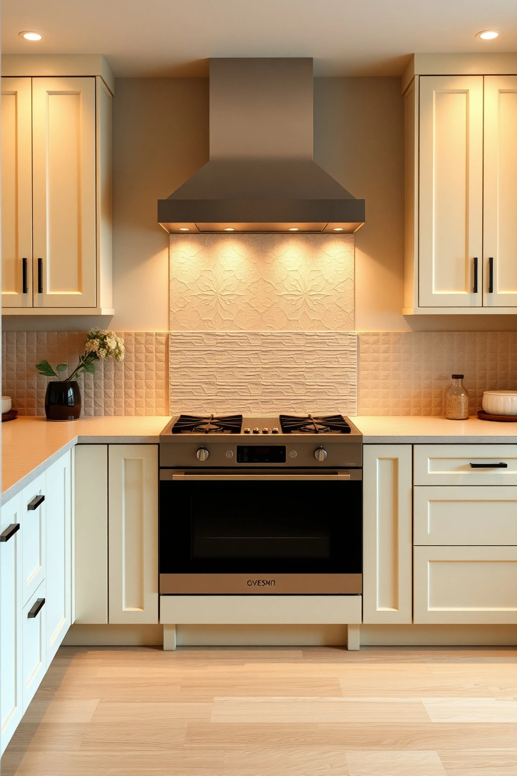
Patterned floors can be risky in a beige kitchen if they’re too busy. But in small doses—like a narrow backsplash, a kickplate, or a short floor runner—pattern adds personality without overwhelming.
Pick a beige-on-beige tile motif with texture or micro-patterns (think Moroccan-inspired but restrained). In a smaller kitchen, keep pattern to one surface: either a 2-foot backsplash band behind the range or a small kitchen entrance mat. Common mistake: using large-scale high-contrast pattern when your beige base is meant to feel calm. If you want the pattern, control the scale and keep the surrounding surfaces plain and smooth. This gives you “designed” without visual noise.
Use a Tonal Storage Wall with Built-Ins (Instead of Loose Shelves)
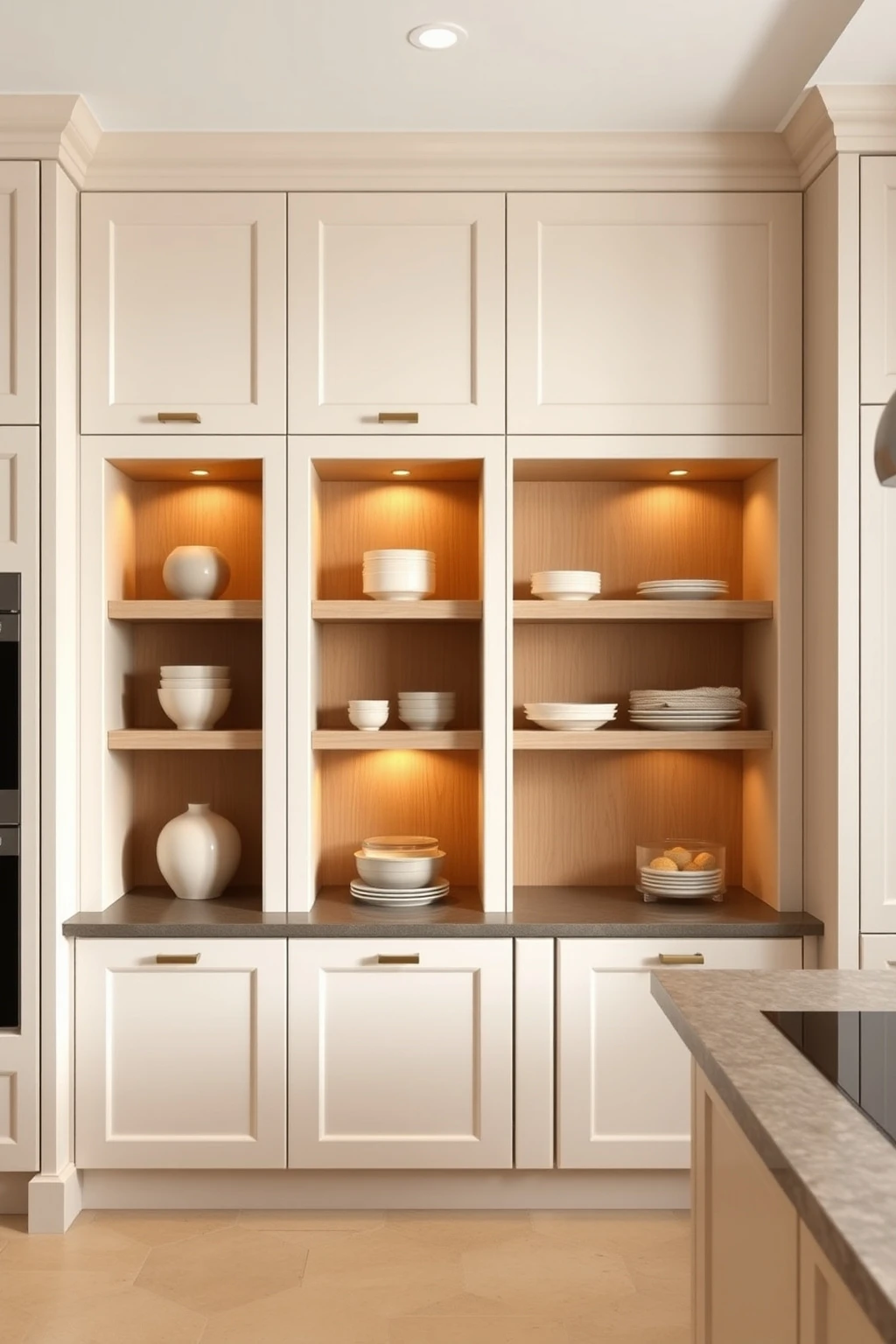
Loose shelving in a beige kitchen can look accidental, especially if different shelves hold different materials. Built-ins create a single architectural “canvas,” which is what modern design actually needs.
Build a storage wall in the same warm ivory as your cabinets, then inset open niches only where you want display. Use one material on the shelf surface—light oak or white oak veneer—so the wall reads cohesive. Keep the depth of open niches around 10–12 inches for visual lightness while still fitting everyday items. Add a simple integrated toe-kick lighting line if you have access; it gives built-ins the high-end glow without busy décor.
Swap a Chunky Island Light for Two Slim Pendants
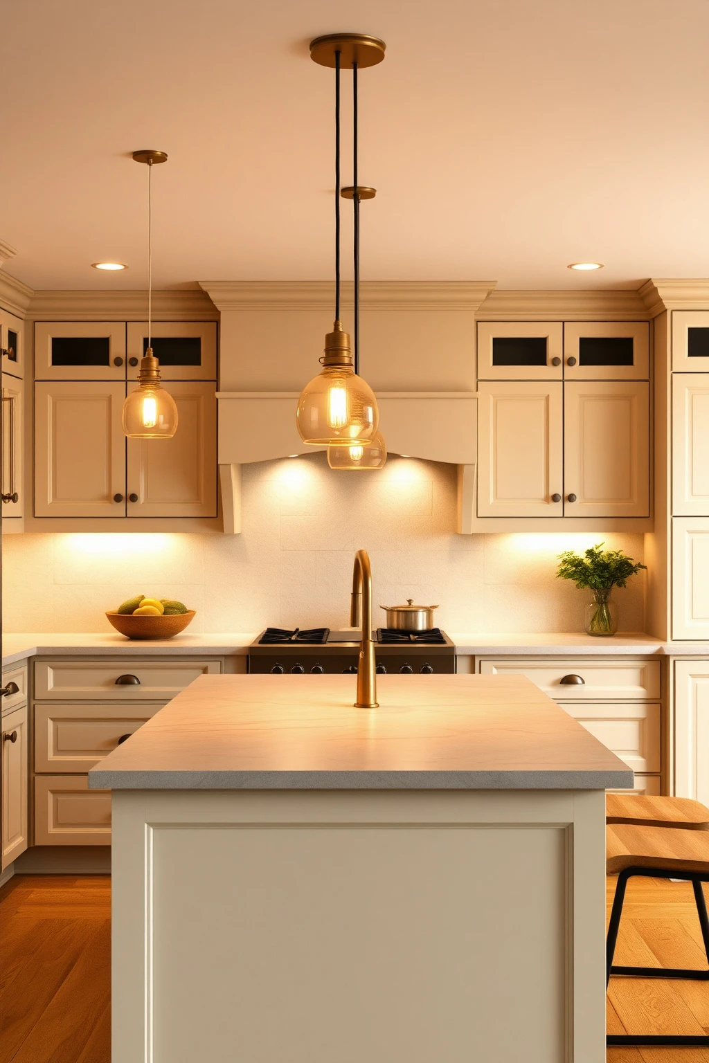
Overhead lighting can either flatter your beige or flatten it into sameness. Chunky fixtures often cast heavy shadows on warm surfaces, especially when beige cabinets have flat doors.
If your island seats 2–3 people, use two slim pendants with warm glass or linen shades. Hang them so the bottom of the shade is about 30–34 inches above the countertop, then center them over the aisle line. Choose warm metals (brushed brass or aged bronze) so beige looks golden, not pale. Make sure pendants don’t compete with under-cabinet lighting—keep the rest of the space on dimmable warm LEDs so you can control mood during dinner.
Add a Brass Sink Faucet Only If Your Metals Are Already Warm
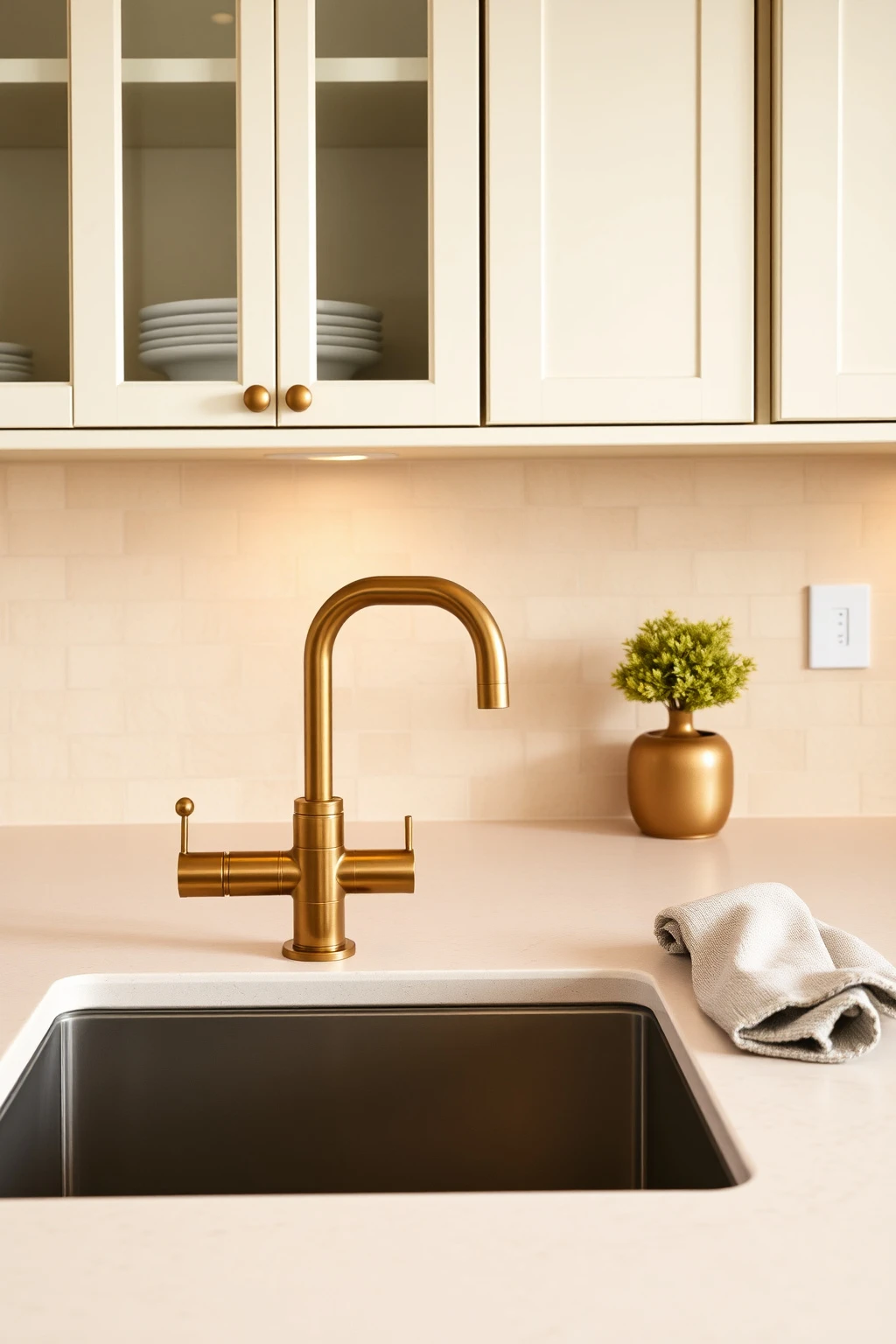
Brass can look luxe in beige kitchens—but only when the rest of your metals share the same warmth. If your other hardware is cool nickel, brass can read yellow and distracting.
Do a quick inventory: if you already have brushed nickel or stainless accents, choose a matte black or brushed nickel faucet instead. If your cabinet pulls are brushed brass or aged bronze, a brass faucet will look cohesive and purposeful. For a modern approach, choose a single-handle gooseneck or a clean cylindrical spout—avoid ornate curves. Also plan for function: a pull-down sprayer works best in busy kitchens and keeps the look streamlined when not in use.
Balance Beige with a Darker Ceiling Fan or Hood Detail
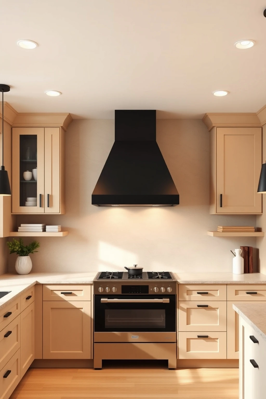
Your kitchen hood or ceiling fan might feel like a utilitarian afterthought, but it’s often the biggest vertical metal feature in the room. In beige kitchens, that vertical line needs contrast or it can disappear visually.
If you have a range hood, paint or choose it in matte black or deep espresso so it becomes a clean “column.” Keep the rest of your metals consistent—match the hood finish to hardware or faucet, not to the exact shade of the countertop. In kitchens without a hood, add contrast through a ceiling fan in aged bronze or matte black. The practical payoff: you create a focal point above cooking, which stabilizes the beige palette and makes the whole room feel designed.
Use a Beige ‘Kickplate’ to Make Lower Cabinets Look Intentional
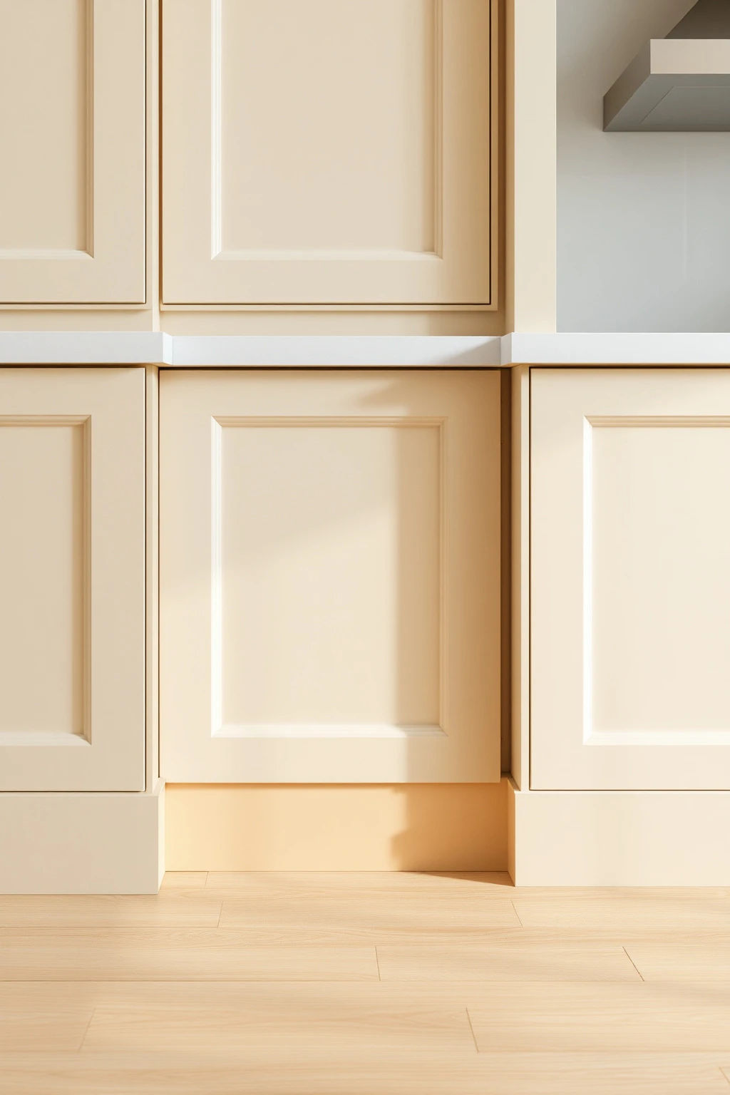
Lower cabinets take the most wear—scuffs, cleaning splashes, and daily contact. A simple kickplate detail can make beige look tailored and protect the finish.
Choose a slightly different warm tone for the kickplate, like sand beige instead of the exact cabinet color. If you’re painting, mask and paint the kickplate separately so you get clean lines at the floor boundary. For wood floors, leave a small gap at the base and caulk carefully so you avoid lifting paint from routine mopping. This trick also helps with visual proportion in narrow kitchens: the base looks defined, and your cabinetry reads taller instead of boxy.
Conclusion
If you remember one principle, let it be this: beige kitchens only look expensive when you treat warmth as a system—undertone, light, texture, and contrast working together. Once those pieces match, you won’t feel like you’re constantly “adding color” to get personality; the room will already do it for you.
Pick one upgrade this week—swap grout tone, adjust under-cabinet lighting angle, or choose a honed stone texture—and you’ll see the whole kitchen start to read warmer and more modern right away.

Mush Decor
Writes about accessible, timeless interior styling for readers worldwide.
More about Mush DecorRelated articles
 Kitchen Ideas
23 Modern Kitchen Ideas for a Stylish Dream Space
Get modern kitchen inspiration with practical styling tips—layout, lighting, finishes, color, storage, and small-space upgrades.
Read More